Table and pivot table visualizations
You can use table and pivot table visualizations to present data in a structured format with customizable elements such as custom and conditional formatting, hyperlinks, and images. This page explains how to control data presentation in table and pivot table visualizations.
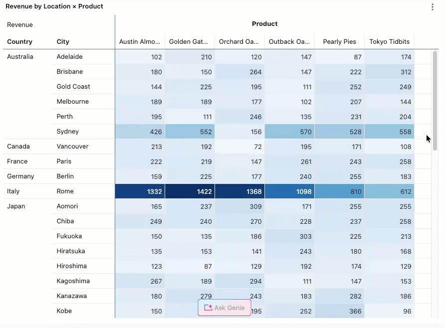
For examples of creating pivot visualizations, see Pivot visualization.
Table visualization versus the results table
A table visualization can be manipulated independently of the original results table that appears under the dataset.
By default, table visualizations appear with all columns hidden. To show or hide columns, click the  eye icon next to the column name.
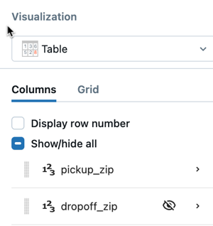
Table configuration
Use the following settings to control which fields appear in the table, how columns are laid out, and how individual field values are displayed and formatted.
Choose what to display
To add a field to the table, click the  plus icon in the Columns section of the visualization editor. The fields you add determine how results are presented:
- If all fields are unaggregated, the table displays row-level results.
- If any field is aggregated (for example, a measure or a sum of a quantitative field), results are grouped by the dimension fields in the table.
To reorder columns, click and drag fields up or down.
Click a field to access field-level settings, where you can transform the field's values, configure display options, and apply formatting. See Field-level settings.
Table layout settings
Access table layout settings from the  kebab menu next to the Columns section.
General tab:
- Display row numbers: Adds a column showing the row number.
- Freeze columns from left: Freezes the first N columns so they remain visible during horizontal scrolling.
- Rows per page: Specifies the number of items on each page of the table.
Style tab:
- Cell sub-tab — Banded rows: Alternates row background colors. When enabled, specify background and font colors for alternating rows.
- Header sub-tab:
- Header height: Specifies the header height in pixels. Header text wraps to fill the specified height. Overflow text is truncated.
- Default style: Set font color, background color, and text formatting (bold, italic, underline) for all column headers.
Field-level settings
Click a field in the visualization editor to access its settings. Settings are organized into the following tabs.
Value tab
- Field: Choose a field to display.
- Change type: Cast the field to a different data type.
- Transform: Apply a transform based on the field's data type.
- Display name: Specify an alias for the column name.
- Header tooltip: Provides a description that appears when users hover over the column header.
- Use for search: When enabled, adds a search box above the table for filtering results.
Styles tab
- Alignment: Choose left, right, or center alignment.
- Column width: Set a pixel value for the column width. Overflow text is truncated.
- Display type: Controls how cell values are rendered:
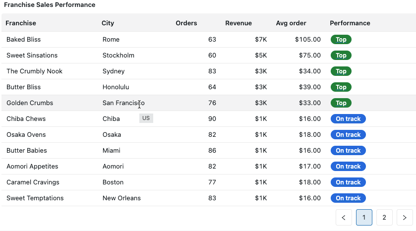
- Basic (default): Renders values as text. Additional formatting options include font colors, font styles, background colors, and conditional coloring.
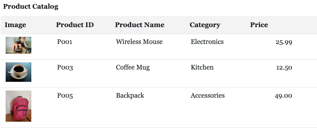
- Image: Takes a base64-encoded string and renders it as an image. To learn how to encode an image as a URL, see Image paths and URLs.
- HTML: Takes an HTML string and renders the HTML output. Content is run through an HTML sanitizer before rendering.
- JSON: Renders a JSON object with expand and collapse exploration.
Format tab
Choose between Auto and Custom formatting:
- Auto: Applies default formatting based on the data type.
- Custom: Enables additional options depending on the data type:
- Numbers: Currency symbols, abbreviations, decimal places, and significant digits.
- Dates and datetimes: Different combinations of time granularities. See Date-time types.
Actions tab
- Link: Specify a custom templated URL. When set, clicking a cell value redirects users to the specified URL. The URL supports
{{@}}as a placeholder for the cell value. Enter a relative path (for example,/sql/dashboardsv3/{{@}}) to append to your Databricks workspace URL, or a fully qualified HTTPS URL (for example,https://databricks.com/{{@}}). - Tooltip: Enable a custom formatted tooltip that appears when users hover over a cell.
Pivot table configuration
Pivot tables aggregate and summarize data across rows and columns. Unlike regular tables, pivot tables let you add dimension fields to either rows or columns to create cross-tabulated views.
Pivot tables support rendering up to 1000 columns x 1000 rows.
Choose what to display
Add fields to the following encodings to control how data appears in the pivot table:
- Rows: Fields display as row headers.
- Columns: Fields display as column headers.
- Values: Fields display as cell values within the pivot table.
Value-level settings
Access value-level settings from the kebab menu next to the Values section:
- Display as: When multiple value fields are selected, choose whether value subheadings appear as rows or columns.
- Header height: Specifies the header height for value column headers.
- Hide column header: Turn on to hide the column header in the pivot table. Use this when the column labels aren't needed, such as when the pivot has a single column grouping.
Table layout settings
Access table layout settings from the kebab menu next to the Columns section:
- Header height: Specifies the header height in pixels. Header text wraps to fill the specified height. Overflow text is truncated.
- Display row numbers: Adds a column showing the row number.
- Freeze columns from left: Freezes the first N columns so they remain visible during horizontal scrolling.
- Rows per page: Specifies the number of items on each page.
Field-level settings
Click a field to access its settings. Available options vary based on whether the field is added as a row, column, or value.
Value tab
- Field: Choose a field to display.
- Transform: Apply a transform based on the field's data type.
- Display name: Specify an alias for the column name.
- For fields added as rows or columns:
- Display totals: Enable to compute and render total values for the dimension.
- Sort: Order the pivot table alphabetically, by value, or in a manual order.
Styles tab
- For fields added as rows or columns:
- Header height: Set header height in pixels. Header text wraps to fill the height; overflow is truncated.
- For fields added as values:
- Cell height and width: Text wraps to fit the specified dimensions. Overflow text is truncated.
- Alignment: Choose left, right, or center alignment.
- Display type: Controls how cell values are rendered:
- Basic (default): Renders values as text with options for font colors, font styles, background colors, and conditional coloring.
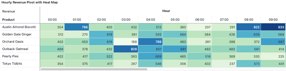
- Color scale: Applies a continuous color gradient background based on cell values.
- Image: Takes a base64-encoded string and renders it as an image. To learn how to encode an image as a URL, see Image paths and URLs.
- HTML: Takes an HTML string and renders the HTML output.
- JSON: Renders a JSON object with expand and collapse exploration.
Format tab
Choose between Auto and Custom formatting:
- Auto: Applies default formatting based on the data type.
- Custom: Enables additional options depending on the data type:
- Numbers: Currency symbols, abbreviations, decimal places, and significant digits.
- Dates and datetimes: Different combinations of time granularities.
Actions tab
Applies to fields added as values only.
- Link: Specify a custom templated URL to redirect users when they click a cell value.
- Tooltip: Enable a custom formatted tooltip on cell hover.
Sticky headers
Pivot table header values are sticky and remain visible while scrolling through table data. This makes it easier to understand context when viewing large pivot tables.
Download pivot tables to Excel
When you download a pivot table visualization to Excel, the data is exported in its pivoted format, preserving row headers, column headers, and aggregated values.
To download a pivot table:
- Click the kebab menu in the upper-right corner of the pivot table widget.
- Select Download as Excel.
Conditional formatting with text functions
Table and pivot table visualizations support dynamic text functions for conditional formatting. You can use the following functions to apply formatting based on text patterns:
contains(): Applies formatting when a cell contains specific text.startswith(): Applies formatting when a cell starts with specific text.endswith(): Applies formatting when a cell ends with specific text.
To use these functions:
- Select a column in the table or pivot table visualization.
- In the Font conditions section, define a rule using one of the text functions.
- Specify the formatting (color, style) to apply when the condition is met.
For example, to highlight all cells containing "Error", use contains("Error") in your font condition rule.