What are custom calculations?
Custom calculations let you define dynamic metrics and transformations without modifying dataset queries. This page explains how to use custom calculations in AI/BI dashboards.
Why use custom calculations?
Custom calculations allow you to create and visualize new fields from existing dashboard datasets without changing the source SQL. You can define up to 200 custom calculations per dataset.
Custom calculations are one of the following types:
- Calculated measures: Aggregated values such as total sales or average cost. Calculated measures can use the
AGGREGATE OVERcommand to compute values across time ranges. - Calculated dimensions: Unaggregated values or transformations such as categorizing age ranges or formatting strings.
Custom calculations behave similarly to metric views, but are scoped to the dataset and dashboard where they are defined. To define custom metrics that can be used with other data assets, see Unity Catalog metric views.
Create dynamic metrics with calculated measures
Suppose you have the following dataset:
Item | Region | Price | Cost | Date |
|---|---|---|---|---|
Apples | USA | 30 | 15 | 2024-01-01 |
Apples | Canada | 20 | 10 | 2024-01-01 |
Oranges | USA | 20 | 15 | 2024-01-02 |
Oranges | Canada | 15 | 10 | 2024-01-02 |
You want to visualize profit margin by region. Without custom calculations, you would need to create a new dataset with a margin column:
Region | Margin |
|---|---|
USA | 0.40 |
Canada | 0.43 |
While this approach works, the new dataset is static and might only support a single visualization. Filters applied to the original dataset do not affect the new dataset without additional manual adjustments.
With custom calculations, you can express the profit margin as an aggregation using the following formula:
(SUM(Price) - SUM(Cost)) / SUM(Price)
This measure is dynamic. When used in a visualization, it automatically updates to reflect the visualization's groupings. For example, the same measure above can be used to visualize profit margin by Region or by Item, depending on what is selected in the visualization.
Define unaggregated values with calculated dimensions
Calculated dimensions let you define unaggregated values or lightweight transformations without changing the source dataset. This is helpful when you want to organize or reformat data for visualization.
For example, to analyze age trends by age group instead of individual ages, you can define a custom age_group dimension using the following expression:
CASE
   WHEN age < 18 THEN '<18'
   WHEN age >= 18 AND age < 25 THEN '18–24'
   WHEN age >= 25 AND age < 35 THEN '25–34'
   WHEN age >= 35 AND age < 45 THEN '35–44'
   WHEN age >= 45 AND age < 55 THEN '45–54'
   WHEN age >= 55 AND age < 65 THEN '55–64'
   WHEN age >= 65 THEN '65+'
END
Define calculations over a window
A common task in dashboard visualizations is to compute an aggregation across a range, such as the rolling sum of sales over the past seven days. Custom calculations support this functionality through window functions, which allow you to perform calculations across a set of rows (a "window") that are related to the current row.
AI/BI dashboards support two kinds of window functions:
- Scalar window functions, which aggregate over fixed groupings and behave as scalar functions. When used alone, they form calculated dimensions.
- Aggregate window functions, which aggregate over dynamic groupings and behave as aggregate functions. When used, they form calculated measures.
Window functions are also the foundation for level of detail expressions, which let you control aggregation granularity independently of your visualization's groupings.
Scalar window functions
Scalar window functions use the OVER operator with optional PARTITION BY and ORDER BY clauses to compute aggregations across related rows before any visualization grouping has occurred. They aggregate over a static set of partitions defined in the window function itself, before being joined back to the untransformed underlying table as a dimension.
Example calculating total sales by region:
SUM(sales) OVER (PARTITION BY Region)
Example calculating cumulative sales per region:
SUM(sales) OVER (PARTITION BY Region ORDER BY Date RANGE BETWEEN UNBOUNDED PRECEDING AND CURRENT ROW)
OVER syntax
<AGGREGATE_FUNCTION>(<column>) OVER (
  [PARTITION BY <dimensions>]
  [ORDER BY <column>]
  [ROWS|RANGE frame_specification]
)
See the Window functions from the SQL language reference for more details.
Aggregate window functions
Aggregate window functions use the AGGREGATE OVER operator to compute windowed aggregations after visualization grouping has been applied. The groups to aggregate over are automatically inherited from the visualization in which the expression is used. You can optionally use a PARTITION BY clause with * to represent all inherited partitions and exclude specific dimensions using the EXCEPT clause. The ORDER BY clause lets you partially aggregate the resulting partitions across adjacent rows, providing "windowing" functionality.
Using the same dataset as the previous example, the following expression computes the trailing seven-day average profit margin using the AGGREGATE OVER operator.
(
  (SUM(Price) - SUM(Cost)) / SUM(Price)
) AGGREGATE OVER (
  ORDER BY Date TRAILING 7 DAY
)
After creation, this measure can be applied in any visualization.
AGGREGATE OVER syntax
<AGGREGATE_EXPRESSION> AGGREGATE OVER (
  [PARTITION BY * [EXCEPT (<field> [, ...])]]
  [ORDER BY <field> <frame_specification>]
)
In this syntax:
PARTITION BY *represents all partitions inherited from the visualization groupingEXCEPT (<field> [, ...])specifies the dimensions to exclude from the partition set- Both
PARTITION BYandORDER BYclauses are optional, but an emptyAGGREGATE OVER ()is not valid
The frame specification can be one of the following:
CURRENTCUMULATIVEALL(TRAILING|LEADING) <number> <unit><number>is a positive integer<unit>isDAY,MONTH, orYEAR- example:
TRAILING 7 DAYorLEADING 1 MONTH
The following table identifies how the frame specification for aggregate over compares to the equivalent SQL window frame clause.
Frame specification | Equivalent SQL window frame clause |
|---|---|
|
|
|
|
|
|
|
|
|
|
If the ORDER BY field is not grouped on in the visualization, AGGREGATE OVER takes the last row's aggregated value as the value to display for each group. This is equivalent to the "last" semi-additive behavior.
OVER versus AGGREGATE OVER
The primary difference between OVER and AGGREGATE OVER is that OVER is a scalar function and AGGREGATE OVER is an aggregate function. OVER requires a PARTITION BY clause to define groups, while AGGREGATE OVER inherits its groups from the surrounding visualization and can incorporate data outside the current group.
Use OVER syntax for:
- Window calculations that need to be used in unaggregated contexts, like tables.
- Window calculations that must ignore all visualization groupings and filters.
- Aggregating at a fixed level of detail: Computing aggregations at a specific granularity using
PARTITION BY. - Using ranking and analytic functions like
ROW_NUMBER,RANK,LAG.
Use AGGREGATE OVER syntax for:
- Window calculations that may be used in a variety of grouping contexts, or need to incorporate data outside of the current group.
- Window calculations that respect visualization filters.
- Aggregating at a coarser level of detail than the visualization: Excluding dimensions using
PARTITION BY * EXCEPT (...). - Time-based ranges that are robust to missing rows: Moving windows with
TRAILINGorLEADING.
Performance benefits
Custom calculations are optimized for performance. For small datasets (≤100,000 rows and ≤100MB), calculations run in the browser for faster responsiveness. Larger datasets are processed by the SQL warehouse. See Dataset optimization and caching for more details.
Create a custom calculation
This example creates a calculated measure based on the samples.nyctaxi.trips dataset. It assumes general knowledge about how to work with AI/BI dashboards. If you are unfamiliar with authoring AI/BI dashboards, see Create a dashboard to get started.
-
Open an existing dataset or create a new one.
-
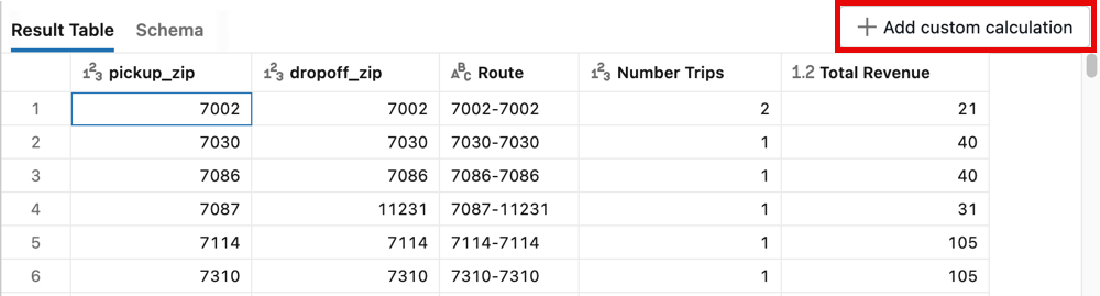
Click + Add custom calculation.
-
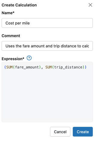
A Create Calculation panel opens on the right side of the screen. In the Name text field, enter Cost per mile.
-
(Optional) In the Comment text field, enter "Uses the fare amount and trip distance to calculate cost per mile."
-
In the Expression field, enter the following:
SQLtry_divide(SUM(fare_amount), SUM(trip_distance)) -
Click Create.
Referencing other calculations
Custom calculations can reference other custom calculations defined in the same dataset. This allows you to build complex metrics by composing simpler calculations, promoting reusability and maintainability.
When referencing another custom calculation, use its name directly in your expression as if it were a column in the dataset.
For example, suppose you've created these calculated measures:
- total_revenue:
SUM(sale_amount) - total_cost:
SUM(cost_amount)
You can create a third calculated measure that references both:
- profit_margin:
(MEASURE(total_revenue) - MEASURE(total_cost)) / MEASURE(total_revenue)
- You can only reference calculations in the same dataset.
- Circular references aren't allowed (calculation A can't reference calculation B if B references A).
- Referenced calculations must be created before they can be used in other expressions.
Add custom calculations to a metric view
This feature is in Public Preview.
You can define custom calculations on top of a dataset created by a metric view. Only the Results Table and Schema are shown when you open the dataset. Click Custom Calculation to define a new custom calculation. To define additional custom metrics that other data assets can use, make changes to the view definition. See Unity Catalog metric views.
To define a new metric view from the dashboard dataset editor, see Export as a metric view.
View the schema
Click the Schema tab in the results panel to view the custom calculation and its associated comment.
Calculated measures are listed in the Measures section and marked by a ![]() fx. The value associated with a calculated measure is dynamically calculated when you set the
fx. The value associated with a calculated measure is dynamically calculated when you set the GROUP BY in a visualization. You cannot see the value in the results table. Calculated dimensions appear in the Dimensions section.

Use a custom calculation in a visualization
You can use the previously created Cost per mile calculated measure in a visualization.
Calculated measures automatically aggregate against the dimensions configured in your chart. This behavior is the same as how dimensions and measures work in metric views, where the aggregation adapts dynamically to the groupings you define in your visualization.
- Click Canvas. Then, place a new visualization widget on the canvas.
- Use the visualization configuration panel to edit the settings as follows:
- Dataset: Taxicab data
- Visualization: Bar
- X axis:
- Field: dropoff_zip
- Scale Type: Categorical
- Transform: None
- Y axis:
- Cost per mile
Table visualizations support calculated dimensions, but do not support calculated measures.
The following image shows the chart.
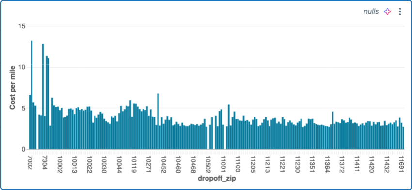
Visualizations with custom calculations automatically update when filters are applied. For example, adding a pickup_zip filter will update the visualization to show only data matching the selected values.
Edit a custom calculation
To edit a calculation:
- Click the Data tab and then click the dataset associated with the calculation that you want to edit.
- Click the Schema tab in the results panel.
- Measures and Dimensions appear under the list of dataset fields. Click the
 kebab menu to the right of the calculation you want to edit. Then, click Edit.
 - In the Edit custom calculation panel, update the text fields that you want to edit. Then, click Update.
Delete a custom calculation
To delete a calculation:
- Click the Data tab and then click the dataset associated with the measure that you want to edit.
- Click the Schema tab in the results panel.
- The Measures section appears under the list of fields. Click the kebab menu to the right of the calculation that you want to edit. Then, click Delete.
- Click Delete in the Delete dialog that appears.
Limitations
To use custom calculations, the following must be true:
- Columns used in the expression must belong to the same dataset.
- Expressions that reference external tables or data sources aren't supported and might fail or return unexpected results.
Supported functions
For a complete reference of all supported functions for custom calculations, see Custom calculation function reference. Attempting to use an unsupported function results in an error.
Examples
The following examples demonstrate common uses for custom calculations. Each custom calculation appears in the dataset's schema on the data tab. On the canvas, you can choose the custom calculation as a field.
Conditionally filter and aggregate data
Use a CASE statement to conditionally aggregate data. The following example uses the samples.nyctaxi.trips dataset and calculates the sum of fares for all rides that start in the 10103 zip code.
SUM(CASE
  WHEN pickup_zip=10103 THEN fare_amount
  WHEN pickup_zip!=10103 THEN 0
END)
Construct strings
Use the CONCAT function to construct a new string value. See concat function and concat_ws function.
CONCAT(first_name, ' ', last_name)
Format dates
Use DATE_FORMAT to format date strings that appear in visualizations.
DATE_FORMAT(tpep_pickup_datetime, 'YYYY-MM-dd')