Get started: Query and visualize data from a notebook
This get started article walks you through using a Databricks notebook to query sample data stored in Unity Catalog using SQL, Python, Scala, and R and then visualize the query results in the notebook.
Requirements
To complete the following article, you must meet the following requirements:
Your workspace must have Unity Catalog enabled. For information on getting started with Unity Catalog, see Set up and manage Unity Catalog.
You must have permission to use an existing compute resource or create a new compute resource. See Get started: Account and workspace setup or see your Databricks administrator.
Step 1: Create a new notebook
To create a notebook in your workspace:
Click
 New in the sidebar, then click Notebook.
On the Create Notebook page:
Specify a unique name for your notebook.
Set the default language for your notebook and then click Confirm if prompted.
Use the Connect dropdown menu to select a compute resource. To create a new compute resource, see Use compute.
To learn more about creating and managing notebooks, see Manage notebooks.
Step 2: Query a table
Query the samples.nyctaxi.trips table in Unity Catalog using the language of your choice.
Copy and paste the following code into the new empty notebook cell. This code displays the results from querying the
samples.nyctaxi.tripstable in Unity Catalog.
SELECT * FROM samples.nyctaxi.trips
Copy and paste the following code into the new empty notebook cell. This code displays the results from querying the
samples.nyctaxi.tripstable in Unity Catalog.
display(spark.read.table("samples.nyctaxi.trips"))
Copy and paste the following code into the new empty notebook cell. This code displays the results from querying the
samples.nyctaxi.tripstable in Unity Catalog.
display(spark.read.table("samples.nyctaxi.trips"))
Copy and paste the following code into the new empty notebook cell. This code displays the results from querying the
samples.nyctaxi.tripstable in Unity Catalog.
library(SparkR)
display(sql("SELECT * FROM samples.nyctaxi.trips"))
Press
Shift+Enterto run the cell and then move to the next cell.The query results appear in the notebook.
Step 3: Display the data
Display the average fare amount by trip distance, grouped by the pickup zip code.
Next to the Table tab, click + and then click Visualization.
The visualization editor displays.
In the Visualization Type drop-down, verify that Bar is selected.
Select
fare_amountfor the X column.Select
trip_distancefor the Y column.Select
Averageas the aggregation type.Select
pickup_zipas the Group by column.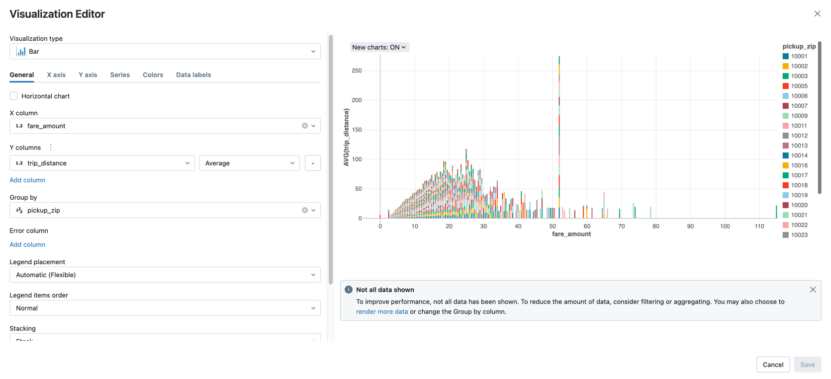
Click Save.
Next steps
To learn how to load data into Databricks using Apache Spark, see Tutorial: Load and transform data using Apache Spark DataFrames.
To learn more about ingesting data into Databricks, see Ingest data into a Databricks lakehouse.
To learn more about querying data with Databricks, see Query data.
To learn more about visualizations, see Visualizations in Databricks notebooks.