Data profiling dashboard
This page describes the dashboard that is automatically created when a profile is run. For an introduction to data profiling, see Data profiling.
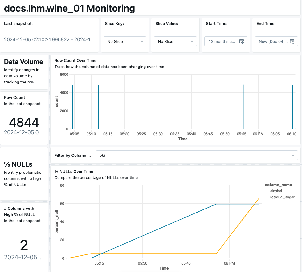
When a profile runs, it creates a dashboard that displays key metrics computed by the profile. The visualizations included in the default dashboard configuration depend on the profile type, and the different metrics are organized into sections. The left side of the dashboard shows lists of the metrics and statistics included in the tables and charts.
The dashboard has user-editable parameters for both the entire dashboard and for each chart, allowing you to customize the date range, data slices, models, and so on. You can also modify the charts shown or add new ones.
The dashboard is created in the user's account and is customizable and shareable like any dashboard. For general information about using and customizing dashboards, including adding new charts, editing charts, viewing queries, and so on, see Dashboards.
View the dashboard
To view the data profiling dashboard, you must use the Databricks workspace from which data profiling was enabled. Do one of the following to view the dashboard:
-
In the left sidebar, click
 Catalog to open the Catalog Explorer UI.
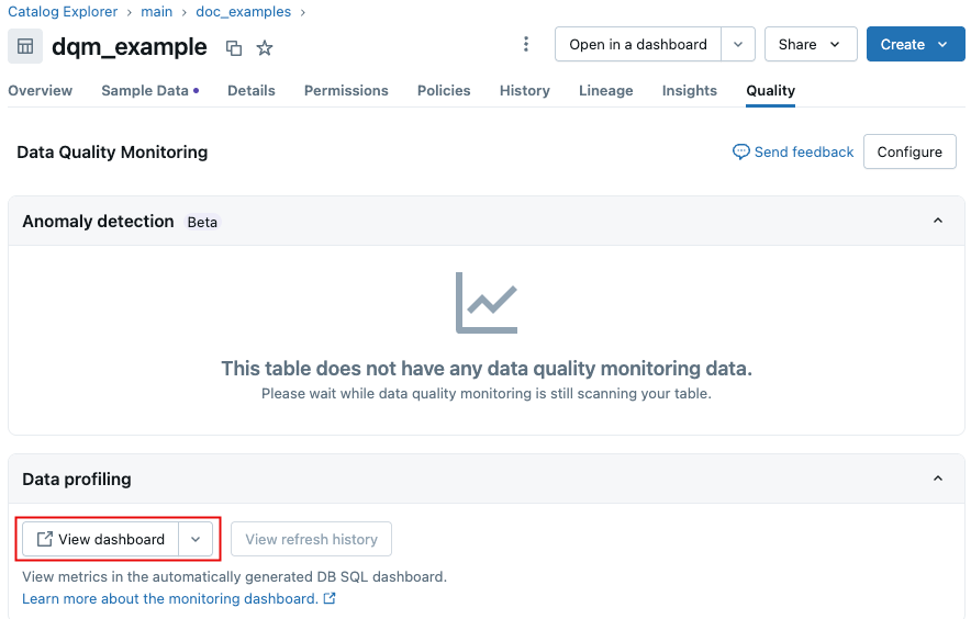
In the catalog directory, navigate to the primary table. On the Quality tab, click View dashboard.
-
In the left sidebar, click
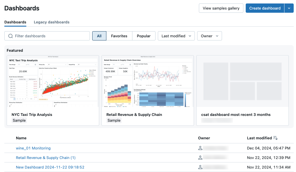
 Dashboards.
By default, the dashboard listing page shows dashboards that you have access to sorted in reverse chronological order. To filter the list by name, type any part of the name into the search box. You can also filter by last modified within a time period, or by owner.
Refresh the dashboard
The dashboard displays metrics that have been calculated by the profile. To refresh the values shown on the dashboard, you must trigger a profile refresh using the UI or the API, or set up a scheduled run (UI, API). You can't refresh the metrics from the dashboard. When you modify the dashboard, statistics aren't recalculated.
The metric tables and the dashboard generated by a profile are updated separately. When you trigger a profile refresh, the metric tables are updated, but the dashboard is not automatically updated. To update the data shown on the dashboard, click the Refresh button on the dashboard.
Similarly, when you click Refresh on the dashboard, it doesn't trigger profile calculations. Instead, it runs the queries over the metric tables that the dashboard uses to generate visualizations. To update the data in the tables used to create the visualizations that appear on the dashboard, you must refresh the profile and then refresh the dashboard.
Select data to display
Use the widgets at the top of the dashboard to control what data is included. The screenshot shows the filters for Snapshot analysis. For Timeseries and InferenceLog analysis, different selectors appear.