Visualizations in Databricks notebooks and SQL editor
Databricks has powerful, built-in tools for creating charts and visualizations directly from your data when working with notebooks or the SQL editor. This page explains how to create, edit, and manage visualizations in notebooks and the SQL editor. To view the types of visualizations you can create, see visualization types.
To learn about the visualization types available for AI/BI dashboards, see AI/BI dashboard visualization types.
Generate a result set to visualize
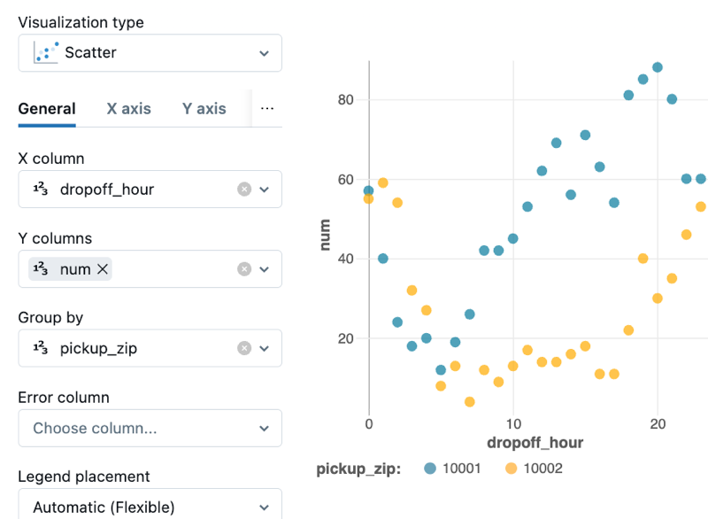
To generate the result set used on this page, use the following code:
- SQL
- Python
Run the following query in the SQL editor.
USE CATALOG samples;
   SELECT
      hour(tpep_dropoff_datetime) as dropoff_hour,
      COUNT(*) AS num
   FROM samples.nyctaxi.trips
   WHERE pickup_zip in ['10001', '10002']
   GROUP BY 1;
Run the following code from a Python cell in a notebook.
from pyspark.sql.functions import hour, col

pickupzip = '10001'  # Example value for pickupzip
df = spark.table("samples.nyctaxi.trips")
result_df = df.filter(col("pickup_zip") == pickupzip) \
              .groupBy(hour(col("tpep_dropoff_datetime")).alias("dropoff_hour")) \
              .count() \
              .withColumnRenamed("count", "num")
display(result_df)
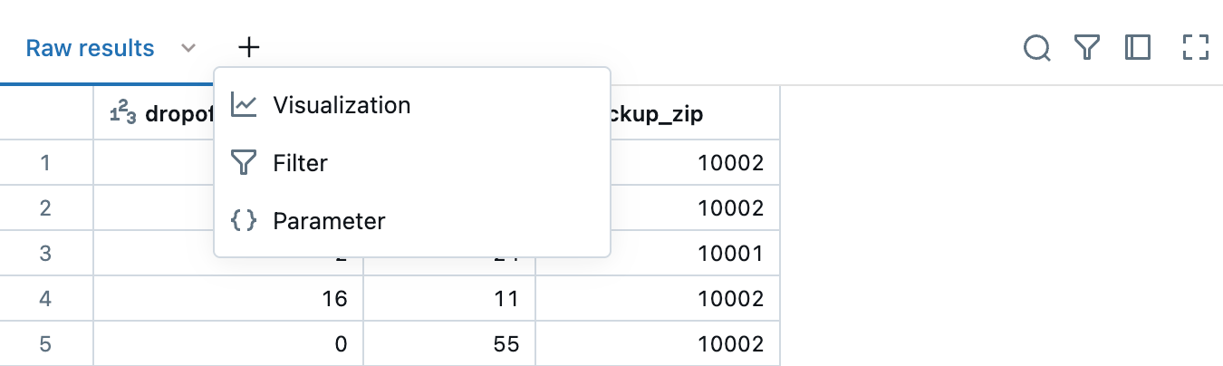
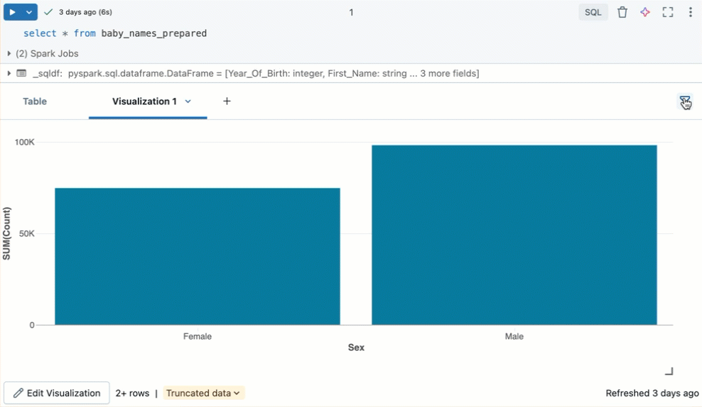
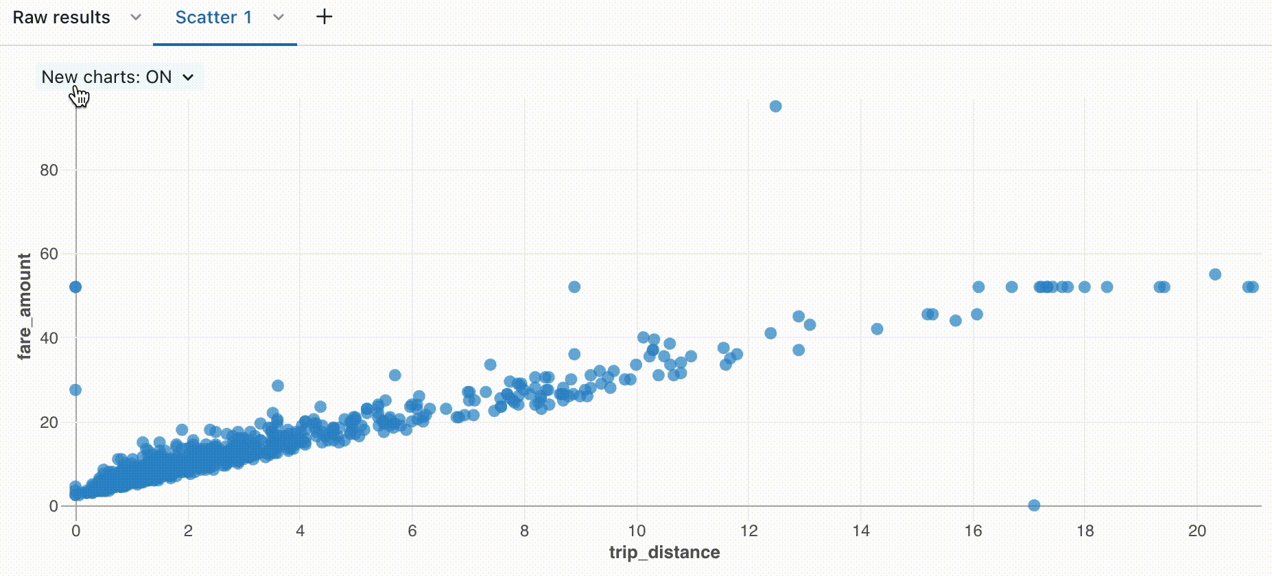
Create a new visualization
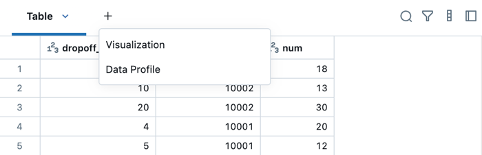
You can create visualizations in the same UI where the results table appears. If you're working in a notebook, you can also generate a data profile, which provide summary statistics and visual insights for DataFrames and tables. To learn more about data profiles, see Generate a data profile.
-
To create a visualization, click + above a result and select Visualization to open the visualization editor.
- SQL editor
- Notebook
-
In the Visualization Type drop-down, choose a type. Then, select the data to appear in the visualization.
-
After making configuration choices, click Save.
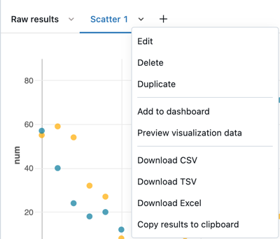
Remove, duplicate, or edit a visualization
To remove, duplicate, or edit a visualization or data profile, click the downward pointing arrow at the right of the tab name. You can also create a dashboard from the menu.
If the cell contains a data profile or runs a language other than SQL, the associated visualization and data profile can only be added to a notebook dashboard. For SQL cells, you'll see an additional Add to dashboard menu item in the drop down. See Add a visualization to a dashboard.
- SQL editor
- Notebook
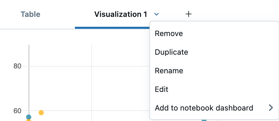
You can also rename the tab by clicking directly on the name and editing the name in place.
Edit a visualization
To edit a visualization:
- Click the downward pointing arrow in the visualization tab. Then, click Edit.
- Use the tabs in the Visualization Editor to access and edit different parts of the chart.
Filter a visualization
To apply a filter on a visualization, click ![]() in the upper right corner and enter the filter conditions to apply.
in the upper right corner and enter the filter conditions to apply.
Filter(s) applied on a visualization will also apply to the results table. Filter(s) applied on the results table will also apply to the visualization.
Clone a visualization
To clone a visualization, click the downward pointing arrow in the visualization tab. Then click Duplicate.
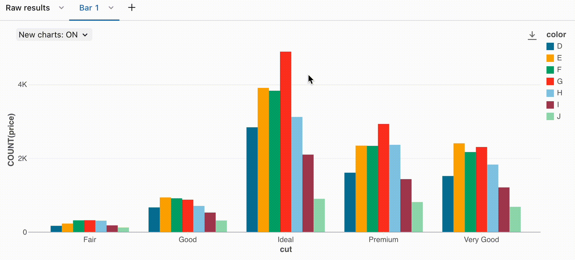
Enable aggregation in a visualization
For bar, line, area, pie, and heatmap charts, you add aggregation directly in the visualization rather than modifying the query to add an aggregation column. This approach has the following advantages:
- You don't need to modify the code that produces the results table.
- Modifying the aggregation allows you to quickly perform scenario-based data analysis.
- The aggregation applies to the entire dataset, not just the first 64,000 rows displayed in a table.
Aggregation is available in the following visualizations:
- Line
- Bar
- Area
- Pie
- Heatmap
- Histogram
Aggregations do not support combination visualizations, such as displaying a line and bars in the same chart.
To aggregate Y-axis columns for a visualization:
-
Open the visualization editor by creating a new chart or editing an existing chart. If you see the message
This visualization uses an old configuration. New visualizations support aggregating data directly within the editor, you must re-create the visualization before you can use aggregation. -
Next to the Y-axis columns, select the aggregation type from the following for numeric types:
- Sum (the default)
- Average
- Count
- Count Distinct
- Max
- Min
- Median
Or from the following for string types:
- Count
- Count Distinct
-
Click Save. The visualization shows the number of rows that it aggregates.
In some cases, you may not want to use aggregation on Y-axis columns. To turn off aggregation, click the kebab menu ![]() next to Y columns and uncheck Use aggregation.
next to Y columns and uncheck Use aggregation.
Edit visualization colors
You can customize a visualization's colors when you create the visualization or by editing it.
- Create or edit a visualization.
- Click Colors.
- To modify a color, click the square and select the new color by doing one of the following:
- Click it in the color selector.
- Enter a hex value.
- Click anywhere outside the color selector to close it.
- Click Save in the Visualization Editor to save the changes.
Temporarily hide or show a series
To hide a series in a visualization, click the series in the legend. To show the series again, click it again in the legend.
To show only a single series, double-click the series in the legend. To show other series, click each one.
Series selection
To select a specific series to analyze on a chart, use the following commands:
- Click on a single legend item to select that series
- Cmd/Ctrl + click on a legend item to select or deselect multiple series

Sorted tooltips
Use tooltips on line charts and unstacked bar charts, ordered by magnitude, for easier analysis.

Zoom
For data-dense charts, zooming in on individual data points can be helpful to investigate details and to crop outliers. To zoom in a chart, click and drag on the canvas. To clear the zoom, hover over the canvas and click the Clear zoom button in the upper right corner of the visualization.
Download a visualization as a PNG file
To dowload a visualization as a PNG file, hover over the canvas and click the download icon in the upper-right corner.
A png file is downloaded to your device.
Add a visualization to a dashboard
- Click the downward pointing arrow at the right of the tab name.
- Select Add to dashboard. A list of available dashboard views appears, along with a menu option Add to new dashboard.
- Select a dashboard or select Add to new dashboard. The dashboard appears, including the newly added visualization.
Legacy visualizations
The latest version of chart visualizations is on by default. The settings in this section describe legacy visualization that you might encounter when working with an older chart or if you have the latest version turned off.
Visualization tools
If you hover over the upper-right of a chart in the visualization editor, a Plotly toolbar appears where you can perform operations such as select, zoom, and pan.

If you do not see the toolbar, your administrator has disabled toolbar display.
Custom color palettes
By default, if a legacy dashboard uses a custom color palette, visualization color choices are ignored. To override this setting, see Use a different color palatte for a visualization.