Notebook and SQL editor visualization types
This page outlines the types of visualizations available to use in Databricks notebooks and in the SQL editor, and shows you how to create an example of each visualization type.
This page covers visualizations for Databricks notebooks and the SQL editor. For visualizations in AI/BI dashboards, see AI/BI dashboard visualization types.
Area chart
Area charts combine the line and bar chart to show how one or more groups' numeric values change over the progression of a second variable, typically that of time. They are often used to show sales funnel changes through time.
Area charts support backend aggregations, providing support for queries returning more than 64K rows of data without truncation of the result set.
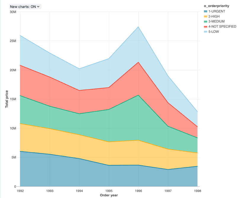
Configuration values: For this area chart visualization, the following values were set:
- X column:
- Dataset column:
o_orderdate - Date level:
Years
- Dataset column:
- Y columns:
- Dataset column:
o_totalprice - Aggregation type:
Sum
- Dataset column:
- Group by (dataset column):
o_orderpriority - Stacking:
Stack - X axis name (override default value):
Order year - Y axis name (override default value):
Total price
Configuration options: For area chart configuration options, see chart configuration options.
SQL query: For this area chart visualization, the following SQL query was used to generate the data set.
select * from samples.tpch.orders
Bar chart
Bar charts represent the change in metrics over time or to show proportionality, similar to a pie chart.
Bar charts support backend aggregations, providing support for queries returning more than 64K rows of data without truncation of the result set.
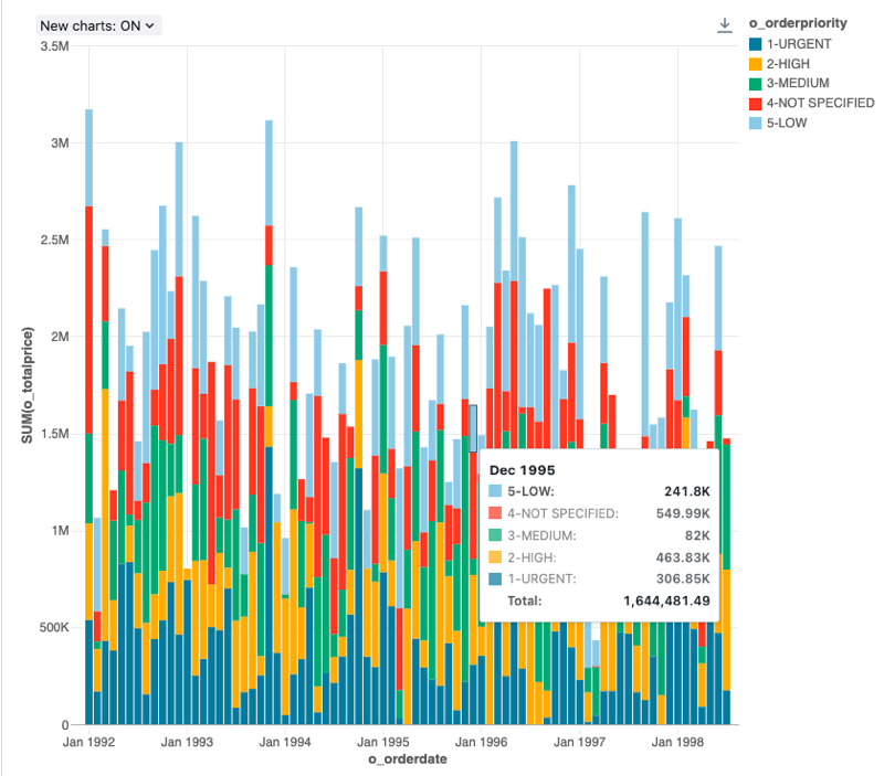
Configuration values: For this bar chart visualization, the following values were set:
- X column:
- Dataset column:
o_orderdate - Date level:
Months
- Dataset column:
- Y columns:
- Dataset column:
o_totalprice - Aggregation type:
Sum
- Dataset column:
- Group by (dataset column):
o_orderpriority - Stacking:
Stack - X axis name (override default value):
Order month - Y axis name (override default value):
Total price
Configuration options: For bar chart configuration options, see chart configuration options.
SQL query: For this bar chart visualization, the following SQL query was used to generate the data set.
select * from samples.tpch.orders
Bubble chart
Bubble charts are scatter charts where the size of each point marker reflects a relevant metric.
Bubble charts support backend aggregations, providing support for queries returning more than 64K rows of data without truncation of the result set.
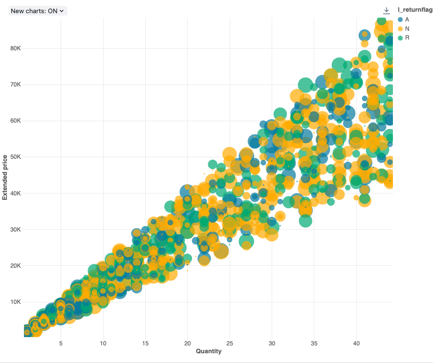
Configuration values: For this bubble chart visualization, the following values were set:
- X (dataset column):
l_quantity - Y columns (dataset column):
l_extendedprice - Group by (dataset column):
l_returnflag - Bubble size column (dataset column):
l_tax - Bubble size coefficient: 20
- Bubble size proportional to:
Area - X axis name (override default value):
Quantity - Y axis name (override default value):
Extended price
Configuration options: For bubble chart configuration options, see chart configuration options.
SQL query: For this bubble chart visualization, the following SQL query was used to generate the data set.
select * from samples.tpch.lineitem where l_quantity < 45
Box chart
The box chart visualization shows the distribution summary of numerical data, optionally grouped by category. Using a box chart visualization, you can quickly compare the value ranges across categories and visualize the locality, spread and skewness groups of the values through their quartiles. In each box, the darker line shows the interquartile range. For more information about interpreting box plot visualizations, see the Box chart article on Wikipedia.
Box charts only support aggregation for up to 64,000 rows. If a dataset is larger than 64,000 rows, data will be truncated.
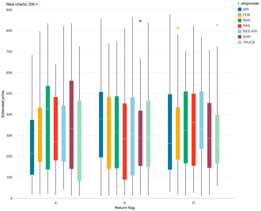
Configuration values: For this box chart visualization, the following values were set:
- X column (dataset column):
l_returnflag - Y columns (dataset column):
l_extendedprice - Group by (dataset column):
l_shipmode - X axis name (override default value):
Return flag - Y axis name (override default value):
Extended price
Configuration options: For box chart configuration options, see box chart configuation options.
SQL query: For this box chart visualization, the following SQL query was used to generate the data set.
select * from samples.tpch.lineitem
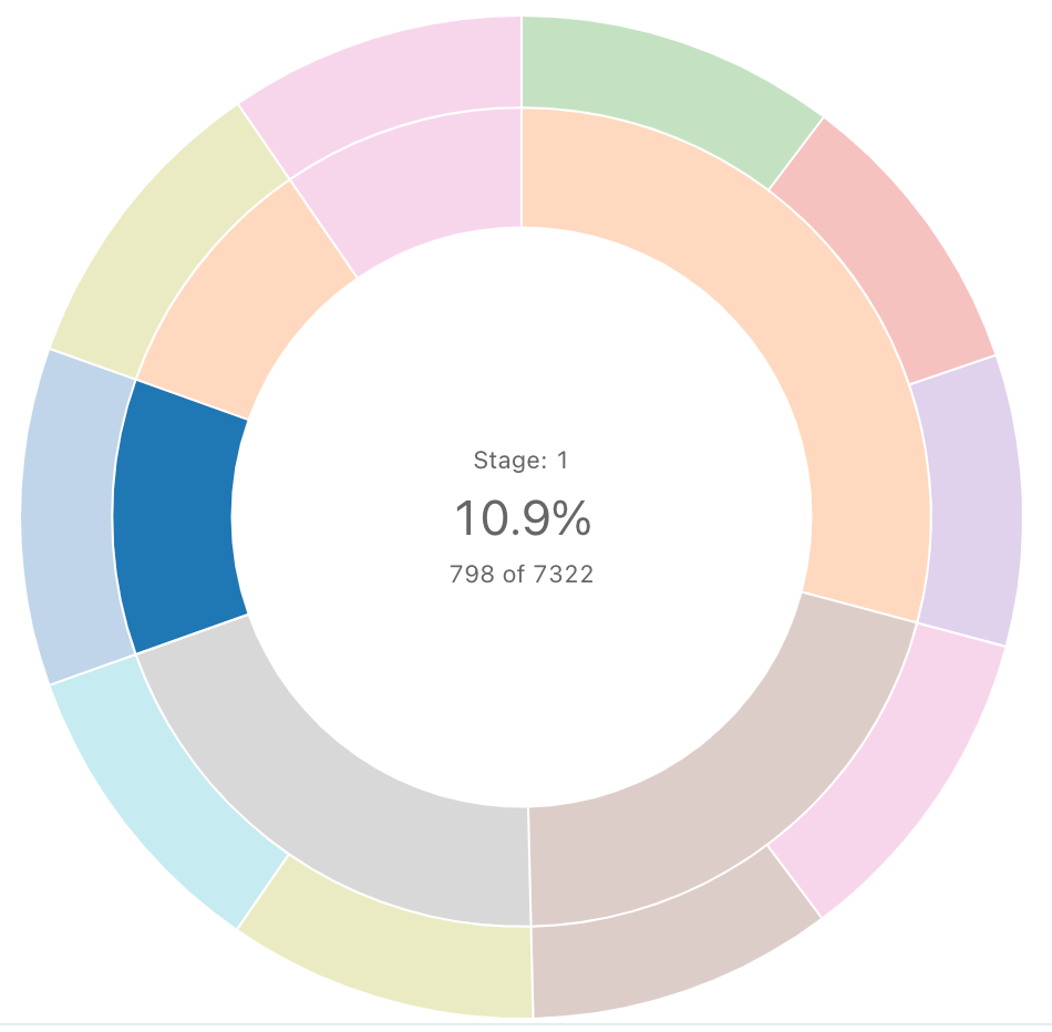
Cohort analysis
A cohort analysis examines the outcomes of predetermined groups, called cohorts, as they progress through a set of stages. The cohort visualization only aggregates over dates (it allows for monthly aggregations). It does not do any other aggregations of data within the result set. All other aggregations are done within the query itself.
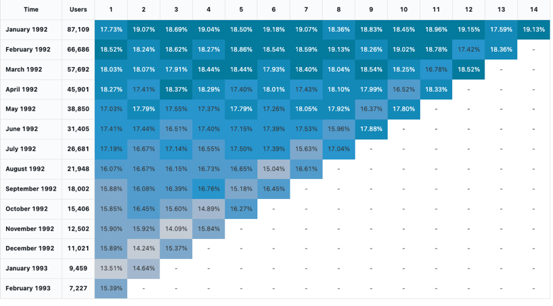
Configuration values: For this cohort visualization, the following values were set:
- Date (bucket) (database column):
cohort_month - Stage (database column):
months - Bucket population size (database column):
size - Stage value (database column):
active - Time interval:
monthly
Configuration options: For cohort configuration options, see cohort chart configuation options.
SQL query: For this cohort visualization, the following SQL query was used to generate the data set.
-- match each customer with its cohort by month
with cohort_dates as (
  SELECT o_custkey, min(date_trunc('month', o_orderdate)) as cohort_month
  FROM samples.tpch.orders
  GROUP BY 1
),
-- find the size of each cohort
cohort_size as (
  SELECT cohort_month, count(distinct o_custkey) as size
  FROM cohort_dates
  GROUP BY 1
)
-- for each cohort and month thereafter, find the number of active customers
SELECT
  cohort_dates.cohort_month,
  ceil(months_between(date_trunc('month', samples.tpch.orders.o_orderdate), cohort_dates.cohort_month)) as months,
  count(distinct samples.tpch.orders.o_custkey) as active,
  first(size) as size
FROM samples.tpch.orders
  left join cohort_dates on samples.tpch.orders.o_custkey = cohort_dates.o_custkey
  left join cohort_size on cohort_dates.cohort_month = cohort_size.cohort_month
WHERE datediff(date_trunc('month', samples.tpch.orders.o_orderdate), cohort_dates.cohort_month) != 0
GROUP BY 1, 2
ORDER BY 1, 2
Combo chart
Combo charts combine line and bar charts to present the changes over time with proportionality.
Combo charts support backend aggregations, providing support for queries returning more than 64K rows of data without truncation of the result set.
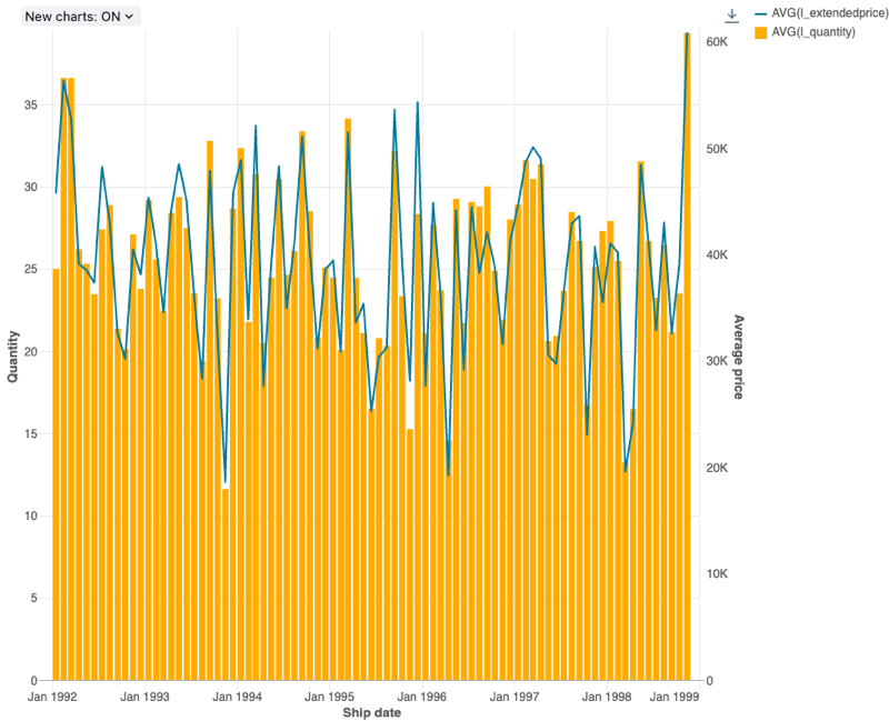
Configuration values: For this combo chart visualization, the following values were set:
- X column:
- Dataset column:
l_shipdate - Date level:
Months
- Dataset column:
- Y columns:
- First dataset column:
l_extendedprice - Aggregation type: average
- Second dataset column:
l_quantity - Aggregation type: average
- First dataset column:
- X axis name (override default value):
Ship date - Left Y axis name (override default value):
Quantity - Right Y axis name (override default value):
Average price - Series:
- Order1 (dataset column):
AVG(l_extendedprice) - Y axis: right
- Type: Line
- Order2 (dataset column):
AVG(l_quantity) - Y axis: left
- Type: Bar
- Order1 (dataset column):
Configuration options: For combo chart configuration options, see chart configuration options.
SQL query: For this combo chart visualization, the following SQL query was used to generate the data set.
select * from samples.tpch.lineitem
Counter display
Counters display a single value prominently, with an option to compare them against a target value. To use counters, specify which row of data to display on the counter visualization for the Value Column and Target Column.
Counter only supports aggregation for up to 64,000 rows. If a dataset is larger than 64,000 rows, data will be truncated.
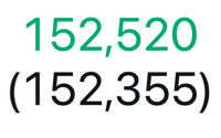
Configuration values: For this counter visualization, the following values were set:
- Value column
- Dataset column:
avg(o_totalprice) - Row: 1
- Dataset column:
- Target column:
- Dataset column:
avg(o_totalprice) - Row: 2
- Dataset column:
- Format target value: Enable
SQL query: For this counter visualization, the following SQL query was used to generate the data set.
select o_orderdate, avg(o_totalprice)
from samples.tpch.orders
GROUP BY 1
ORDER BY 1 DESC
Funnel visualization
The funnel visualization helps analyze the change in a metric at different stages. To use the funnel, specify a step and a value column.
Funnel only supports aggregation for up to 64,000 rows. If a dataset is larger than 64,000 rows, data will be truncated.
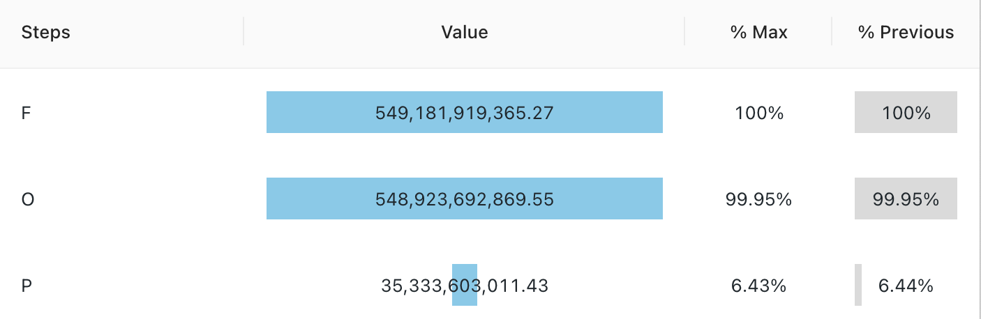
Configuration values: For this funnel visualization, the following values were set:
- Step column (dataset column):
o_orderstatus - Value column (dataset column):
Revenue
SQL query: For this funnel visualization, the following SQL query was used to generate the data set.
SELECT o_orderstatus, sum(o_totalprice) as Revenue
FROM samples.tpch.orders
GROUP BY 1
Heatmap chart
Heatmap charts blend features of bar charts, stacking, and bubble charts allowing you to visualize numerical data using colors. A common color palette for a heatmap shows the highest values using warmer colors, like orange or red, and the lowest values using cooler colors, like blue or purple.
For example, consider the following heatmap that visualizes the most frequently occurring distances of taxi rides on each day and groups the results by the day of the week, distance, and the total fare.
Heatmap charts support backend aggregations, providing support for queries returning more than 64K rows of data without truncation of the result set.

Configuration values: For this heatmap chart visualization, the following values were set:
- X column (dataset column):
o_orderpriority - Y columns (dataset column):
o_orderstatus - Color column:
- Dataset column:
o_totalprice - Aggregation type:
Average
- Dataset column:
- X axis name (override default value):
Order priority - Y axis name(override default value):
Order status - Color name (override default value):
Average price - Color scheme (override default value):
YIGnBu
Configuration options: For heatmap configuration options, see heatmap chart configuation options.
SQL query: For this heatmap chart visualization, the following SQL query was used to generate the data set.
select * from samples.tpch.orders
Histogram charts
A histogram plots the frequency that a given value occurs in a dataset. A histogram helps you to understand whether a dataset has values that are clustered around a small number of ranges or are more spread out. A histogram is displayed as a bar chart in which you control the number of distinct bars (also called bins).
Histogram charts support backend aggregations, providing support for queries returning more than 64K rows of data without truncation of the result set.

Configuration values: For this histogram chart visualization, the following values were set:
- X column (dataset column):
o_totalprice - Number of bins: 20
- X axis name (override default value):
Total price
Configuration options: For histogram chart configuration options, see histogram chart configuration options.
SQL query: For this histogram chart visualization, the following SQL query was used to generate the data set.
select * from samples.tpch.orders
Line chart
Line charts present the change in one or more metrics over time.
Line charts support backend aggregations, providing support for queries returning more than 64K rows of data without truncation of the result set.
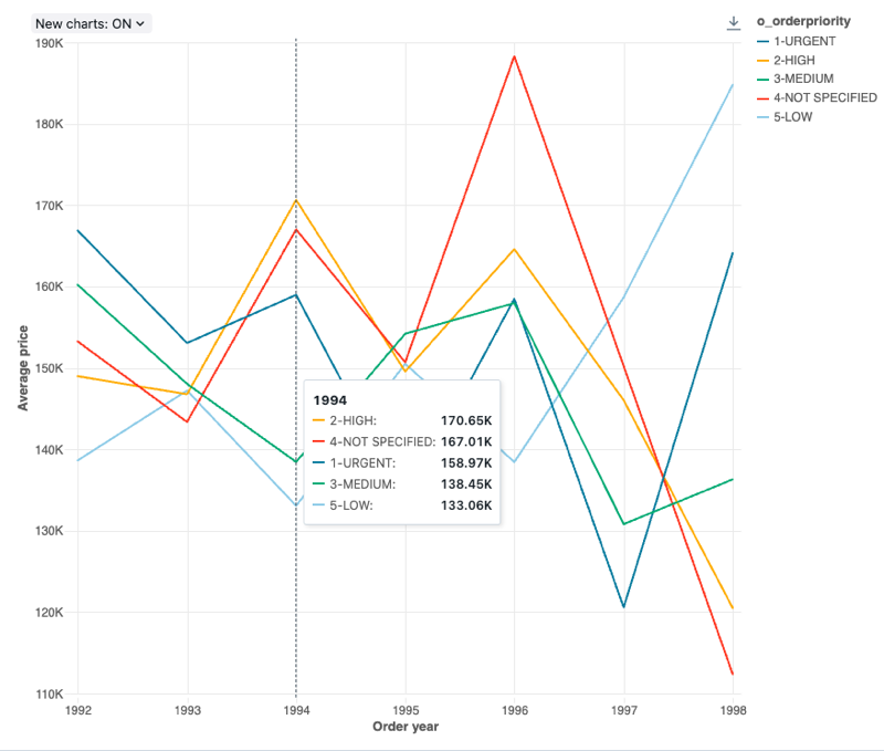
Configuration values: For this line chart visualization, the following values were set:
- X column:
- Dataset column:
o_orderdate - Date level:
Years
- Dataset column:
- Y columns:
- Dataset column:
o_totalprice - Aggregation type:
Average
- Dataset column:
- Group by (dataset column):
o_orderpriority - X axis name (override default value):
Order year - Y axis name (override default value):
Average price
Configuration options: For line chart configuration options, see chart configuration options.
SQL query: For this line chart visualization, the following SQL query was used to generate the data set.
select * from samples.tpch.orders
Map (Choropleth) visualization
In choropleth visualizations, geographic localities, such as countries or states, are colored according to the aggregate values of each key column. The query must return geographic locations by name.
Choropleth visualizations do not do any aggregations of data within the result set. All aggregations must be computed within the query itself.
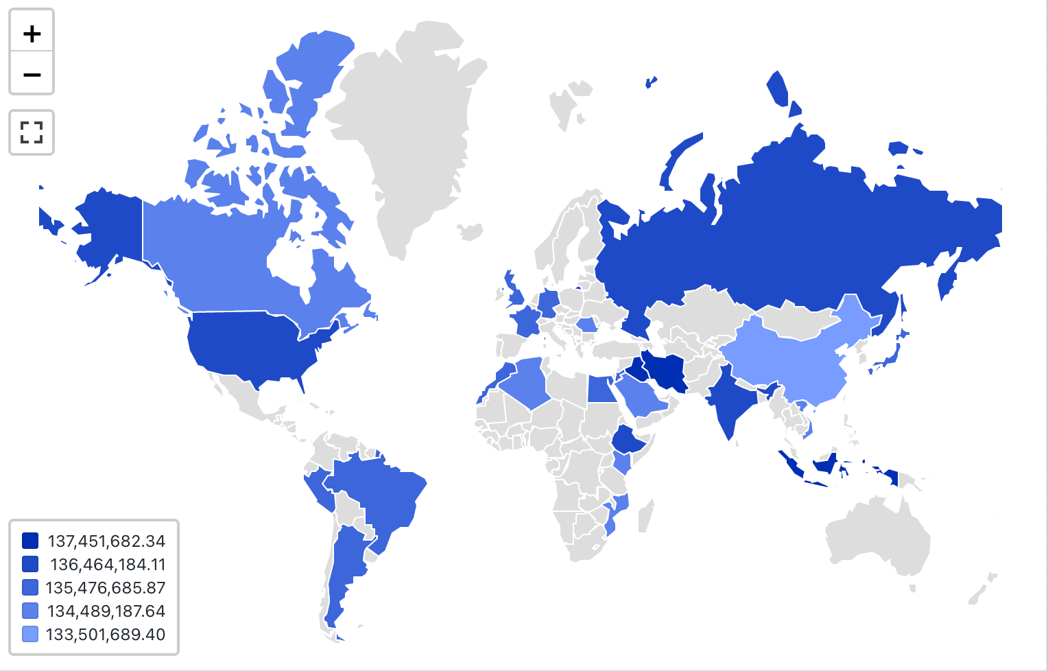
Configuration values: For this choropleth visualization, the following values were set:
- Map (dataset column):
Countries - Geographic column (dataset column):
Country - Geographic type: Short name
- Value column (dataset column):
Revenue - Clustering mode: equidistant
Configuration options: For choropleth configuration options, see choropleth configuation options.
SQL query: For this choropleth visualization, the following SQL query was used to generate the data set.
SELECT
initcap(n_name) as Country,
sum(c_acctbal)
FROM samples.tpch.customer
join samples.tpch.nation where n_nationkey = c_nationkey
GROUP BY 1
Map (Markers) visualization
In marker visualizations, a marker is placed at a set of coordinates on the map. The query result must return latitude and longitude pairs.
Marker does not do any aggregations of data within the result set. All aggregations must be computed within the query itself.
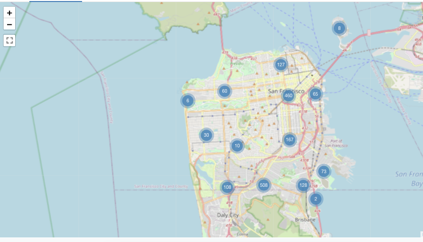
This marker example is generated from a dataset that includes both latitude and longitude values - which are not available in the Databricks sample datasets. For choropleth configuration options, see marker configuration options.
Pie charts
Pie charts show proportionality between metrics. They are not meant for conveying time series data.
Pie charts support backend aggregations, providing support for queries returning more than 64K rows of data without truncation of the result set.
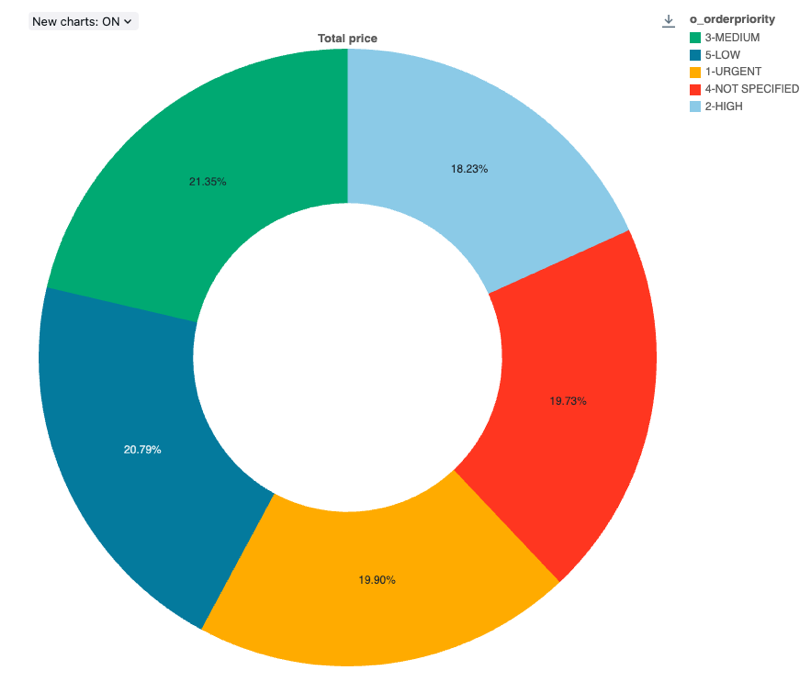
Configuration values: For this pie chart visualization, the following values were set:
- X column (dataset column):
o_orderpriority - Y columns:
- Dataset column:
o_totalprice - Aggregation type:
Sum
- Dataset column:
- Label (override default value):
Total price
Configuration options: For pie chart configuration options, see chart configuration options.
SQL query: For this pie chart visualization, the following SQL query was used to generate the data set.
select * from samples.tpch.orders
Pivot table visualization
A pivot table visualization aggregates records from a query result into a new tabular display. It's similar to PIVOT or GROUP BY statements in SQL. You configure the pivot table visualization with drag-and-drop fields.
Pivot tables support backend aggregations, providing support for queries returning more than 64K rows of data without truncation of the result set. However, Pivot table (legacy) only support aggregation for up to 64,000 rows. If a dataset is larger than 64,000 rows, data will be truncated.
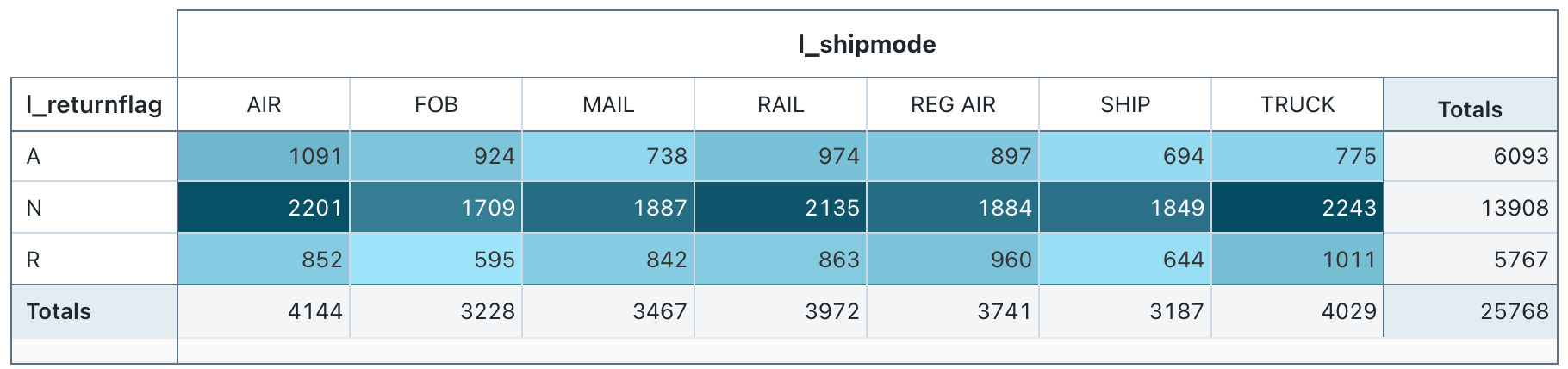
Configuration values: For this pivot table visualization, the following values were set:
- Select rows (dataset column):
l_returnflag - Select columns (dataset column):
l_shipmode - Cell
- Dataset column:
l_quantity - Aggregation type: Sum
- Color cells by value: On
- Dataset column:
SQL query: For this pivot table visualization, the following SQL query was used to generate the data set.
select * from samples.tpch.lineitem
Sankey
A sankey diagram visualizes the flow from one set of values to another.
Sankey visualizations do not do any aggregations of data within the result set. All aggregations must be computed within the query itself.
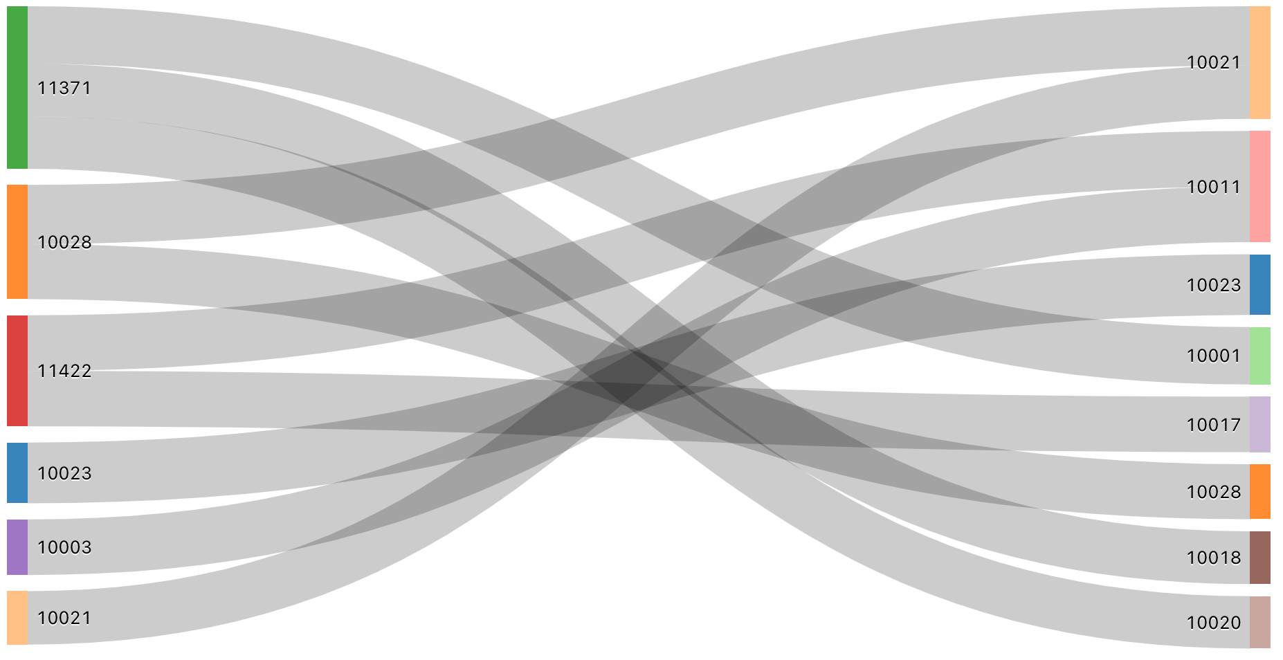
SQL query: For this Sankey visualization, the following SQL query was used to generate the data set.
SELECT pickup_zip as stage1, dropoff_zip as stage2, sum(fare_amount) as value
FROM samples.nyctaxi.trips
GROUP BY 1, 2
ORDER BY 3 DESC
LIMIT 10
Scatter chart
Scatter visualizations are commonly used to show the relationship between two numerical variables. Additionally, a third dimension can be encoded with color to show how the numerical variables are different across groups.
Scatter charts support backend aggregations, providing support for queries returning more than 64K rows of data without truncation of the result set.
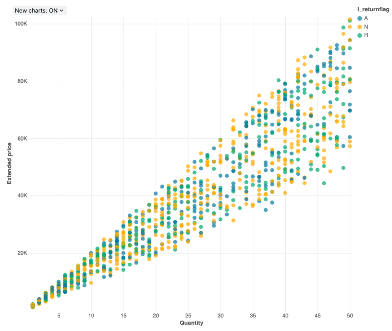
Configuration values: For this scatter chart visualization, the following values were set:
- X column (dataset column):
l_quantity - Y column (dataset column):
l_extendedprice - Group by (dataset column):
l_returnflag - X axis name (override default value):
Quantity - Y axis name (override default value):
Extended price
Configuration options: For scatter chart configuration options, see chart configuration options.
SQL query: For this scatter chart visualization, the following SQL query was used to generate the data set.
select * from samples.tpch.lineitem
Sunburst sequence
A sunburst diagram helps visualize hierarchical data using concentric circles.
Sunburst sequence does not do any aggregations of data within the result set. All aggregations must be computed within the query itself.
SQL query: For this sunburst visualization, the following SQL query was used to generate the data set.
SELECT pickup_zip as stage1, dropoff_zip as stage2, sum(fare_amount) as value
FROM samples.nyctaxi.trips
GROUP BY 1, 2
ORDER BY 3 DESC
LIMIT 10
Table
The table visualization displays data in a standard table, but with the ability to manually reorder, hide, and format the data. Table visualizations can display up to 100,000 rows.
Table visualizations do not do any aggregations of data within the result set. All aggregations must be computed within the query itself.
Formatting settings support special data types such as images, JSON, and URLs. For more details, see table configuration options.
Word cloud
A word cloud visually represents the frequency a word occurs in the data.
Word cloud only supports aggregation for up to 64,000 rows. If a dataset is larger than 64,000 rows, data will be truncated.
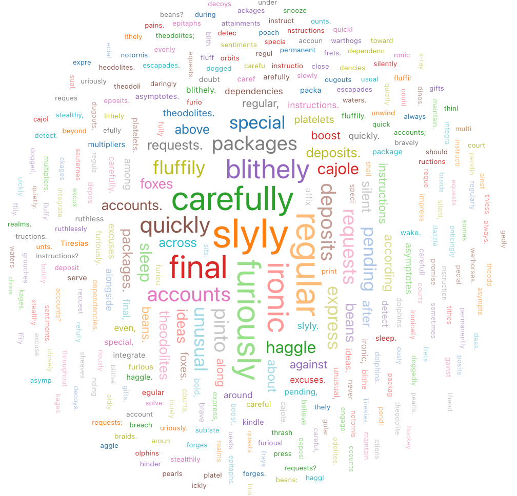
Configuration values: For this word cloud visualization, the following values were set: test
- Words column (dataset column):
o_comment - Words Length Limit: Min = 5
- Frequencies limit: Min = 2
SQL query: For this word cloud visualization, the following SQL query was used to generate the data set.
select * from samples.tpch.orders