Create a dashboard
Learn how to use the AI/BI dashboard UI to create and share insights. For information about dashboard features, see Dashboards.
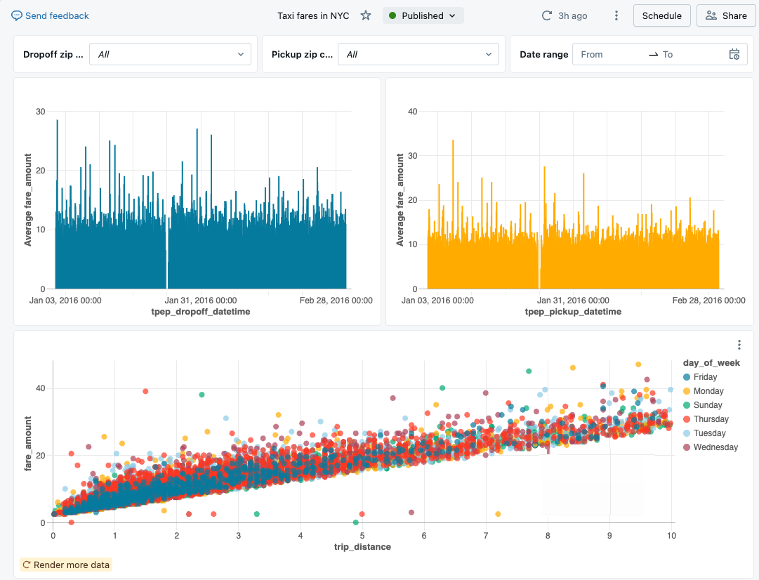
The steps in this tutorial demonstrate how to build and share the following dashboard:
You can also create a dashboard using the Dashboard Authoring Agent, see Use Genie Code for dashboard authoring.
Requirements
- You are logged into a Databricks workspace.
- You have the Databricks SQL entitlement in that workspace.
- You have at least CAN USE access to one or more SQL warehouses.
Step 1. Create a dashboard
Click ![]() New in the sidebar and select Dashboard.
New in the sidebar and select Dashboard.
By default, your new dashboard is automatically named with its creation timestamp and stored in your /Workspace/Users/<username> directory.
Step 2. Define datasets
The Data tab is for defining the underlying datasets used in your dashboard. This query accesses data from the samples catalog on Databricks. The table includes publicly available taxicab data from New York City in 2016. Query results are limited to valid rides that are under 10 miles and cost less than fifty dollars.
-
Click the Data tab.
-
Click Add SQL dataset.
-
Paste the following query into the editor. Then click Run to return a collection of records.
SQLSELECT
T.tpep_pickup_datetime,
T.tpep_dropoff_datetime,
T.fare_amount,
T.pickup_zip,
T.dropoff_zip,
T.trip_distance,
T.weekday,
CASE
WHEN T.weekday = 1 THEN 'Sunday'
WHEN T.weekday = 2 THEN 'Monday'
WHEN T.weekday = 3 THEN 'Tuesday'
WHEN T.weekday = 4 THEN 'Wednesday'
WHEN T.weekday = 5 THEN 'Thursday'
WHEN T.weekday = 6 THEN 'Friday'
WHEN T.weekday = 7 THEN 'Saturday'
ELSE 'N/A'
END AS day_of_week
FROM
(
SELECT
dayofweek(tpep_pickup_datetime) as weekday,
*
FROM
`samples`.`nyctaxi`.`trips`
WHERE
trip_distance > 0
AND trip_distance < 10
AND fare_amount > 0
AND fare_amount < 50
) T
ORDER BY
T.weekday -
Inspect your results. The returned records appear in the Result table when the query is finished running.
-
Double click on the title to rename your dataset Taxicab data.
Step 3. Add a visualization
To create your first visualization, complete the following steps:
-
Click the Untitled page tab.
-
Click
 Add a visualization to add a visualization widget and use your mouse to place it on the canvas.
Step 4. Configure your visualization
When a visualization widget is selected, you can use the configuration panel on the right side of the screen to display your data. As shown in the following image, only one Dataset has been defined, and it is selected automatically.
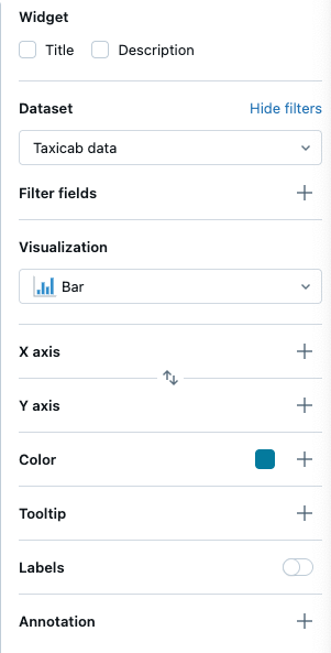
Setup the X-axis
- If necessary, select Bar from the Visualization drop-down menu.
- Click the
 plus icon to choose the data presented along the X-axis. You can use the search bar to search for a field by name. Select tpep_dropoff_datetime.
 - Click the field name you selected to view additional configuration options.
- As the Scale Type, select Continuous.
- For the Transform selection, choose HOURLY.
Setup the Y-axis
- Click the plus icon next to the Y-axis to select the fare_amount for the data presented along the y-axis.
- Click the field name you selected to view additional configuration options.
- As the Scale Type, select Continuous.
- For the Transform selection, choose AVG.
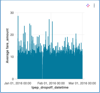
Your chart should look like the follwong example:
Optional: Create visualizations with Genie Code
You can create visualizations using natural language with Genie Code.
To generate the same chart as above, choose one of the following options:
- To create a new visualization widget:
- From an AI/BI dashboard, open the Genie Code side panel.
- In the bottom right corner, select Agent. This toggles on Genie Code's Agent mode, allowing you to interact with Genie Code for dashboard authoring.
- Type “Bar chart of average fare amount over hourly dropoff time”. To create a dashboard using Genie Code, see Use Genie Code for dashboard authoring.
Step 5. Clone and modify a visualization
You can clone an existing chart to create a new visualization.
- Right-click on your existing chart and then click Clone.
- With your new chart selected, use the configuration panel to change the X-axis field to tpep_pickup_datetime. If necessary, choose HOURLY under the Transform type.
- Use the Color selector to choose a new color for your new bar chart.
Step 6. Create a scatterplot
Create a new scatterplot with colors differentiated by value. To create a scatterplot, complete the following steps:
-
Click the Create a visualization icon
to create a new visualization widget. -
Configure your chart by making the following selections:
- Dataset: Taxicab data
- Visualization: Scatter
- X axis: trip_distance
- Y axis: fare_amount
- Color: Click the plus icon > day_of_week
noteAfter colors have been auto-assigned by category, you can change the color associated with a particular value by clicking on the color in the configuration panel.
Step 7. Create dashboard filters
You can use filters to make your dashboards interactive. In this step, you create filters on three fields.
Create a date range filter
- Click
 Add a filter (field/parameter) to add a filter widget.
 - Click Widget title and enter Date range to retitle your filter.
- From the Filter drop-down menu in the configuration panel, select Date range picker.
- Click the plus icon next to the Fields menu. Click tpep_pickup_datetime from the drop-down menu.
Create a single-select drop-down filter
- Click Add a filter (field/parameter) to add a filter widget.
- Click Widget title and enter Dropoff zip code to retitle your filter.
- From the Filter drop-down menu in the configuration panel, select Single value.
- From the Fields menu, select dropoff_zip.
Clone a filter
- Right-click on your Dropoff zip code filter. Then, click Clone.
- Double-click on the title and enter Pickup zip code to retitle the cloned widget.
- Click the
 to remove the current field. Then, select pickup_zip to filter on that field.
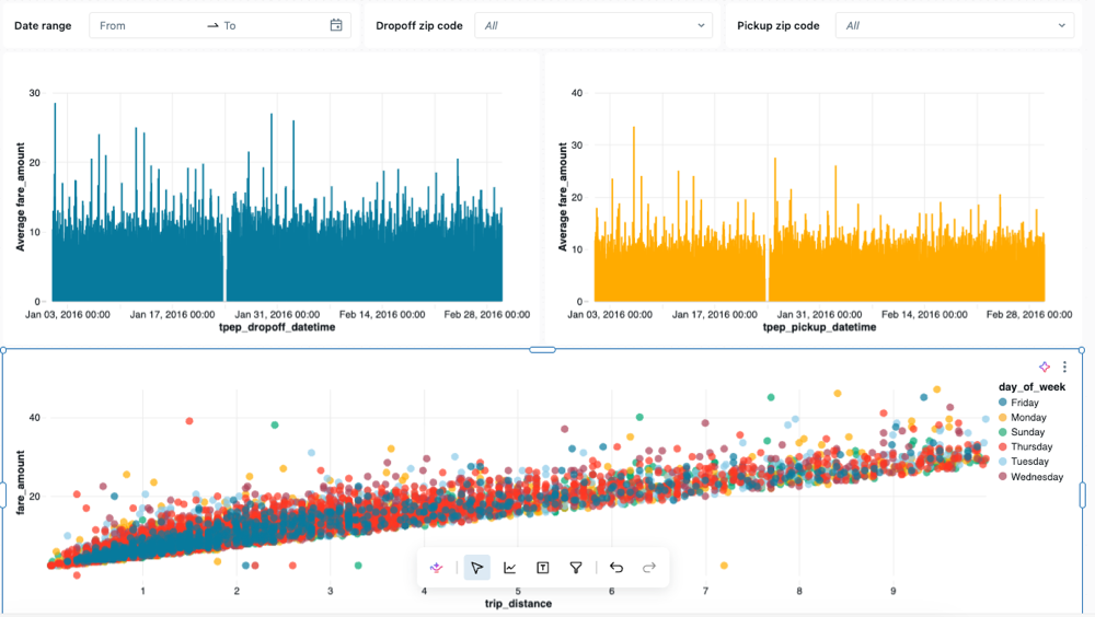
Step 8. Resize and arrange charts and filters
Use your mouse to arrange and resize your charts and filters.
The following image shows one possible arrangement for this dashboard.
Step 9. Publish and share
While you develop a dashboard, your progress is saved as a draft. To create a clean copy for easy consumption, publish your dashboard.
- Click Publish in the upper-right corner of the dashboard.
- Click Share with data permissions (default).
- Click Publish. A Sharing dialog opens.
- Add users, groups, or service principals that you want to share with. Set permission levels as appropriate. See Share a dashboard and Dashboard ACLs to learn more about permissions and rights.
- Click Copy link and paste it in a new tab to go to your published dashboard.