Dashboard visualizations
This article explains how to use and customize visualization widgets on AI/BI dashboards.
Create and configure a chart
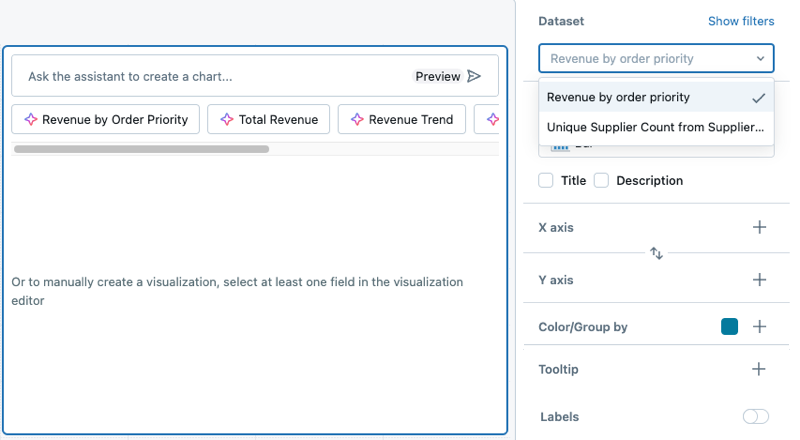
After adding a visualization widget to the canvas, the Visualization Configuration panel appears on the right side of the screen. By default, the first dataset listed on the Data tab is selected, and the default visualization type is a Bar chart.

To create a chart, use the following steps:
- Select a dataset: Use the Dataset drop-down to choose the dataset for your visualization.
- Add filters (optional): Click Show filters to apply a static filter or parameter to your visualization. You can filter on any field. If your dataset includes a parameter, an option to apply it will also appear.
- Choose a visualization type: Select a visualization type from the Visualization drop-down menu. For details about available visualization types and their configurations, see AI/BI dashboard visualization types.
- Define x-axis and y-axis fields: After selecting a dataset, choose the fields to display on the x-axis and y-axis. You can reorder fields by dragging them into the desired position. For chart labels, you can use the display name field to rename the axis label.
If you use the Databricks Assistant to generate a chart, the dataset and visualization selections automatically adjust based on your request. For step-by-step guidance on creating AI-assisted visualizations, see Create visualizations with Databricks Assistant.
Apply chart formatting
Charts include customizable formatting options for axes, colors, labels, and tooltips. Formatting options vary by chart type and dataset values.
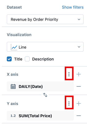
The following screenshot highlights the kebab menus used for formatting the x and y axes.

Format axis settings
To format the x-axis or y-axis, use the kebab menu in the respective X Axis or Y Axis section of the visualization editing panel.
Configure the following settings:
- Show axis title: Enabled by default. Enter a custom title or clear the checkbox to hide the axis title.
- Show axis values: Enabled by default. Clear the checkbox to hide axis values.
Depending on the type of data represented, additional controls appear.
For continuous data:
- Custom minimum and maximum values: Type in values to set limits on the displayed data.
- Reverse axis: Select Reverse Axis to show the axis values in descending order.
- Scale function: Choose Linear or Log (Symmetric).
- Click Format to view additional formatting options. Auto automatically formats your chart and is selected by default. Click Custom to see additional formatting options. See Format numeric values.
For categorical data:
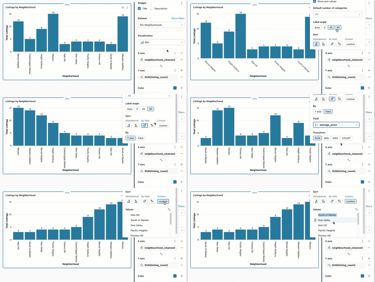
- Label Angle: Choose the angle at which to apply the labels. Auto is selected by default.
- Sort: Choose how to order categorical values on the axis:
- Alphabetical: Sort category names alphabetically
- By field: Sort by a measure field value in ascending or descending order. After selecting the sort direction, choose which field to use:
- Y axis: Sort by the measure field displayed on the Y axis
- Field: Sort by any other measure field in the dataset, even if it's not displayed on the chart. Select the field from the dropdown and choose the aggregation (SUM, MIN, MAX, or COUNT). This is useful for ordering categories by metrics that provide context without cluttering the visualization.
- Custom: Arrange values in a specific order. Hover over a value and use the grab-handle to drag it into position.

If any of the listed options are unavailable, they cannot be applied to the selected chart type.
Format numeric values
You can format numbers for axis tick labels, data labels, and tooltips. To access formatting options:
- Click the
kebab menu next to X Axis or Y Axis in the chart configuration panel.
- Click Format and choose from the following options:
- Type: None, Currency ($), Percentage (%)
- Abbreviation: None, Compact, Scientific
- Decimal places: Max, Exact, All, or a custom number of places
- Group separator: Optionally, include a comma or other separator.
Different currency formats are available. After selecting Currency, choose your preferred option from the drop-down menu.
Customize chart elements
You can format chart legends, colors, tooltips, and value labels.
Chart colors
To change chart colors:
- Click a color in the chart to open the color picker.
- Enter a HEX or RGB value for an exact color.
- Click the
kebab menu in the Color section to adjust the opacity of all colors.
Legend
Click the kebab menu in the Color section to show options for changing the visibility, title, or position of the chart legend. The following options are available:
- Show legend: Use the checkbox to show or hide the legend.
- Show legend title: Use the checkbox to show or hide the legend title. When the title is visible, you can type to override the default value, which is the column name.
- Legend position: Use the drop-down to adjust the legend's placement in the visualization widget. Legends can be positioned at the top, bottom, left, or right of the visualization.
Tooltips
Tooltips display precise measures of the data under the pointer. By default, they show values from the x-axis, y-axis, and any color/grouping fields. To add more fields to a tooltip:
- Click the + button in the Tooltip section of the visualization editor.
- Use the drop-down to select additional fields, or use the text entry box to search by name.
If the Tooltip section is not present in the visualization editor, that chart type does not support tooltip customization.
Value labels
Use the toggle to turn data labels on or off. When enabled, you can choose how the labels display:
- Auto: Displays y-axis values as labels.
- Field: Select a specific field to display as labels. You can apply a transformation (such as SUM or AVG) and choose formatting options for the selected field.
Null values are not displayed as labels on the chart. You can use conditional logic to selectively display labels.
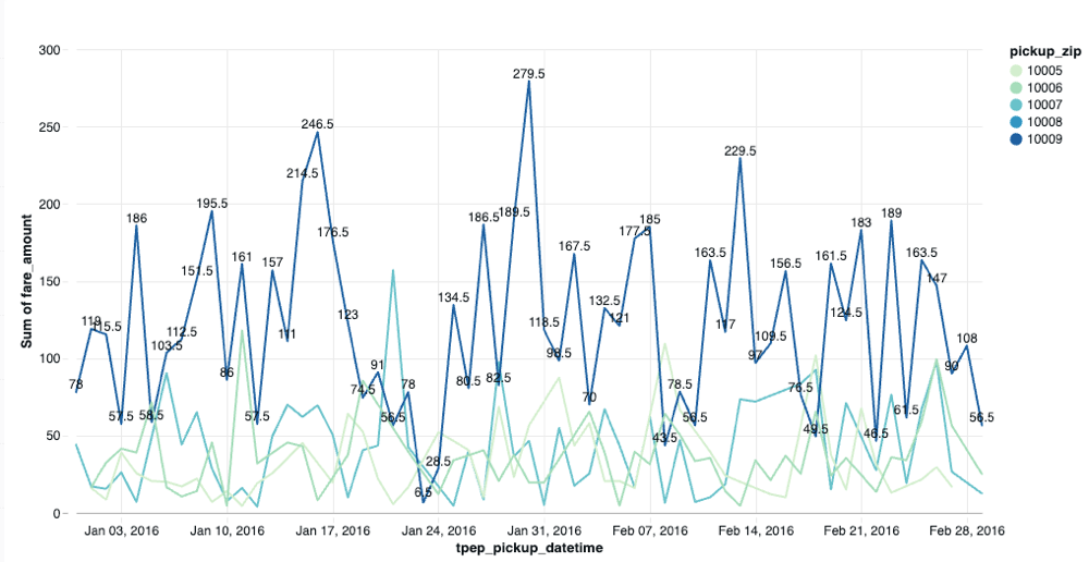
The following query creates a dataset where labels appear only for specific data points:
SELECT
  *,
  CASE
    WHEN pickup_zip = 10009 THEN fare_amount
    ELSE NULL
  END AS custom_label
FROM
  main.samples.taxi_trips
When you use custom_label as the value label field, only data points where pickup_zip = 10009 display labels showing the fare_amount. All other data points with null values appear on the chart without labels.

Size settings
The Size setting controls visual dimensions for line charts, scatter charts, bubble charts, and point maps. Its usage depends on the chart type:
Line charts:
- If no series are specified in the Size area, the slider changes all line thickness uniformly.
- If series are specified in the Size area, you can set different thickness values for each series.
Scatter and bubble charts:
- Add a field to the Size setting to vary the point marker size based on a metric.
- When size is based on a data field, the chart becomes a bubble chart where each point's size reflects the metric value.
Point maps: Use the Size setting to vary map marker sizes based on a quantitative field, showing magnitude at different geographical locations.
Gridlines
Charts support toggling gridlines on and off to improve readability. Gridlines appear by default on supported chart types and help viewers interpret data points by providing visual reference lines aligned with axis values.
To toggle gridlines:
- In the visualization configuration panel, locate the gridline options.
- Use the toggle to show or hide gridlines for the chart.
Gridlines automatically adjust based on your custom background colors and axis formatting settings.
Annotations
Annotations are horizontal or vertical reference lines that you can add to charts to track thresholds, targets, or benchmarks. For example, you can add a horizontal line at 100 to show your sales target or mark a performance baseline.
The following chart types support annotations:
- Bar
- Line
- Area
- Scatter
- Heatmap
- Box
- Combo
- Histogram
- Waterfall
To add an annotation:
- In the visualization configuration panel, locate the Annotation section.
- Click the + button to add a new annotation.
- Select the line orientation:
- Horizontal: Draws a line parallel to the x-axis at a specified y-axis value
- Vertical: Draws a line parallel to the y-axis at a specified x-axis value
- Enter the value where the line should appear on the chart.
- (Optional) Enter a label to describe the annotation. The label appears on the chart next to the line.
- (Optional) Click the color picker to customize the line color.
You can add multiple annotations to a single chart to track different thresholds or reference points.
Other visualization types
To learn more about working with table visualizations, see Table and pivot table visualizations.
To learn more about working with map visualizations, see Map visualizations.