Compare MLflow runs and models using graphs and charts
This page describes how to use the visualizations that are available for comparing runs in the MLflow UI. The chart view page shows a collection of charts comparing the runs of an experiment. You can customize this page by selecting runs to include, modifying charts, and creating new charts. With MLflow 3, all of these features are available for models from the Models tab as well. For more details, see Track and compare models using MLflow Logged Models.
MLflow metadata for experiments and runs is also available in system tables, where you can leverage Databricks SQL and all the lakehouse tooling Databricks offers to visualize your experiment data. See MLflow system tables reference for further details.
To display the chart view page, click the Chart view icon on the experiment details page.

For information about the runs list page, see View training results with MLflow runs. To display runs from multiple experiments, see Compare runs from multiple experiments.
Chart overview
By default, charts on this page show the most recent 10 runs. As you roll your cursor over the lines on a chart, details for that run appear.
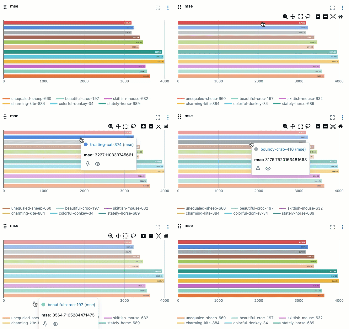
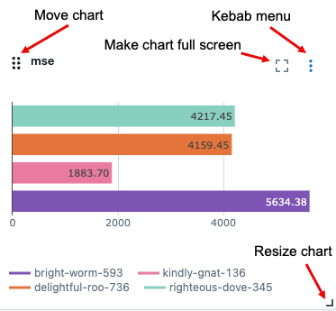
You can move or resize a chart, or enlarge it to full screen. A kebab menu at the upper-right of the chart lets you edit, delete, or download the chart.
Select runs to display
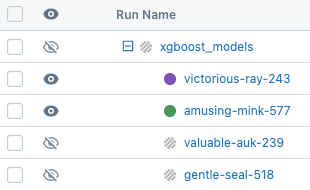
To select the number of runs to display, click at the top of the list of runs.
Runs that are shown on the charts are indicated by and a colored dot. Runs not shown on the charts are indicated by
and a grayed-out dot.
Manage runs
To delete, compare, or add or remove tags from a run, check the box next to the left of the run(s). When one or more runs is checked, the Delete, Compare, and Add tags buttons appear.

For details about the comparing runs page, see Compare runs.
Filter runs
Use the search field to the right of the Chart view icon to filter runs based on parameter or metric values or by tag. For details, see Filter runs.
Sort runs
To change the sort order of runs shown in the charts, select the parameter to sort by from the Sort dropdown menu.
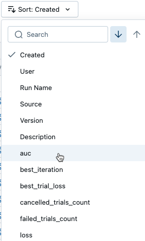
Group runs
To group runs by parameter value, select one or more parameters from the Group by dropdown menu.
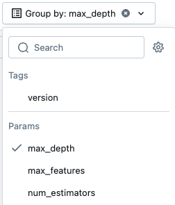
Create new visualizations
To add a chart, click Add chart, and select the type of chart to add from the dropdown menu.
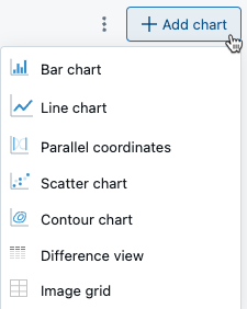
Parallel coordinates chart
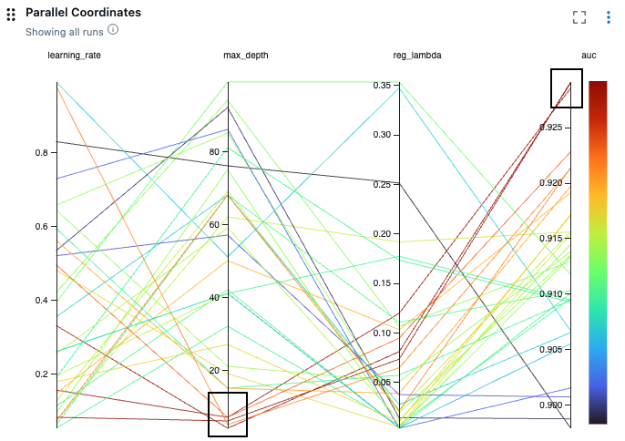
A parallel coordinates plot is useful in understanding the effect of parameter settings on model performance and investigating relationships between parameters and metrics. To create a parallel coordinates plot, select Parallel coordinates from the menu. In the dialog, select the parameters and metrics to investigate.
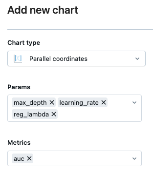
In this example, the runs highlighted in the black boxes suggest that lower values for max_depth result in higher values for the metric auc.
