AI/BI dashboard visualization types
This page outlines the types of visualizations available to use in AI/BI dashboards and shows you how to create an example of each visualization type. For instructions on building a dashboard, see Create a dashboard. You can use natural language to prompt Genie Code to create bar, line, point map, scatter, pie, and counter charts. See Use Genie Code for dashboard authoring.
This page covers visualizations for AI/BI dashboards. For visualizations in Databricks notebooks and the SQL editor, see Notebook and SQL editor visualization types.
For information about visualization rendering limits, see Dashboard limits.
Area visualization
Area visualizations combine the line and bar visualizations to show how one or more groups' numeric values change over the progression of a second variable, typically that of time. They are often used to show sales funnel changes through time.
To adjust the layout:
- Click the
 kebab menu in the Y Axis section of the visualization editing panel.
 - In the Layout section, choose Stack or 100% Stack.
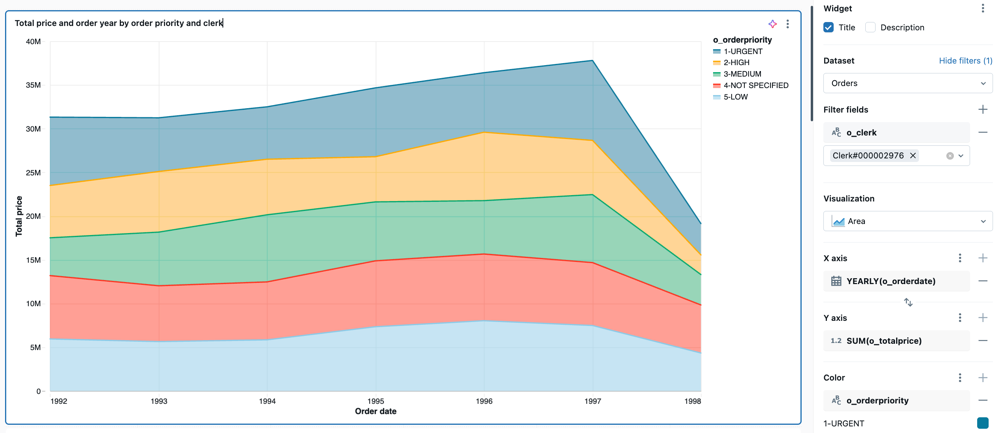
Configuration values: For the provided area visualization example, the following values were set:
- Dataset: samples.tpch.orders
- Visualization: Area
- Title:
Total price and order year by order priority and clerk - X-axis:
- Field:
o_orderdate - Transform:
Yearly - Scale Type:
Continuous - Display name:
Order year
- Field:
- Y-axis:
- Field:
o_totalprice - Display name:
Total price - Scale Type:
Continuous - Transform:
Sum
- Field:
- Color:
- Field:
o_orderpriority - Legend title:
Order priority
- Field:
- Filter
- Field:
TPCH orders.o_clerk
- Field:
SQL query: For this area visualization, the following SQL query was used to generate the dataset named TPCH orders.
SELECT * FROM samples.tpch.orders;
Bar chart
Bar charts represent the change in metrics over time or across categories and show proportionality, similar to a pie visualization.
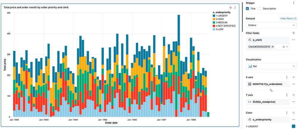
To adjust the layout:
- Click the kebab menu in the Y Axis section of the visualization editing panel.
- In the Layout section, choose Stack or 100% Stack, or Group.
Configuration values: For the provided bar chart example, the following values were set:
- Dataset: samples.tpch.orders
- Visualization: Bar
- Title:
Total price and order month by order priority and clerk - X-axis:
- Field:
o_orderdate - Transform:
Monthly - Scale Type:
Continuous - Display name:
Order month
- Field:
- Y-axis:
- Field:
o_totalprice - Scale Type:
Continuous - Transform:
Sum - Display name:
Total price
- Field:
- Color:
- Field:
o_orderpriority - Legend title:
Order priority
- Field:
- Filter
- Field:
TPCH orders.o_clerk
- Field:
SQL query: The following SQL query generated the dataset TPCH orders for this bar visualization.
SELECT * FROM samples.tpch.orders;
Box chart
The box chart visualization shows the distribution summary of numerical data, optionally grouped by category. Using a box chart visualization, you can quickly compare the value ranges across categories and visualize the locality, spread, and skewness groups of the values through their quartiles. In each box, the darker line shows the interquartile range. For more information about interpreting box plot visualizations, see the Box chart article on Wikipedia.

For the provided box chart example, the following values were set:
- X column (dataset column):
l-returnflag - Y columns (dataset column):
l_extendedprice - X display name:
Return flag1 - Y display name:
Extended price
SQL query: For this box chart visualization, the following SQL query was used to generate the dataset.
SELECT * FROM samples.tpch.lineitem;
Bubble chart
Bubble charts are scatter charts where the size of each point marker reflects a relevant metric. To make a bubble chart, select Scatter as your visualization type. In the Size setting, select the metric you want represented by the size of the markers.
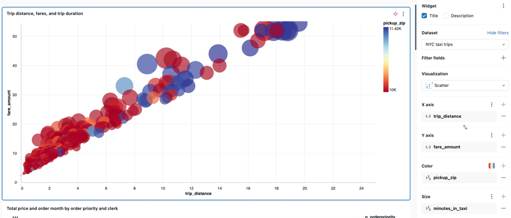
Configuration values: For the provided bubble chart example, the following values were set:
- Dataset: NYC taxi trips
- Visualization: Scatter
- Title:
Trip distance, fares, and trip duration - X-axis:
- Field:
trip_distance - Scale type:
Continuous - Transform:
None
- Field:
- Y-axis:
- Field:
fare_amount - Scale type:
Continuous - Transform:
None
- Field:
- Color by:
- Field:
pickup_zip
- Field:
- Size:
- Field:
minutes_in_taxi - Transform:
None
- Field:
SQL query: For this bubble chart visualization, the following SQL query was used to generate the dataset.
SELECT
  *,
  TIMESTAMPDIFF(MINUTE, tpep_pickup_datetime, tpep_dropoff_datetime) AS minutes_in_taxi
FROM samples.nyctaxi.trips
LIMIT 500;
Choropleth map
In choropleth visualizations, geographic localities, such as countries or states, are colored according to the aggregate values of each key column. The query must return geographic locations by name. Users can create maps that display administrative boundaries at the country, state or province, and county or district level.
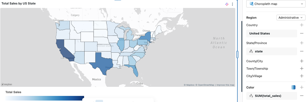
For a configuration example and choropleth map options, see Choropleth options.
Cohort chart
Cohort charts visualize user retention and behavior patterns over time by grouping users based on a shared characteristic (such as sign-up date) and tracking their activity across subsequent time periods. This visualization helps you understand how different cohorts of users engage with your product or service over time.
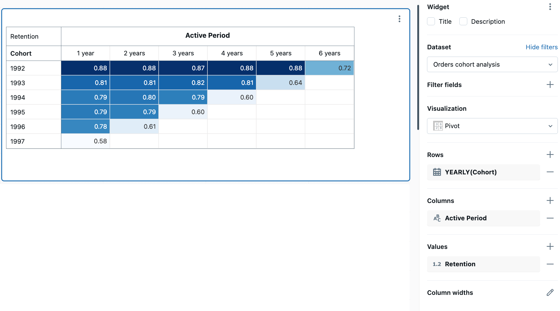
To create a cohort chart, use a pivot visualization with retention data. The following example tracks customer retention by calculating when customers first placed an order (their cohort date) and measuring how many customers from each cohort remain active in subsequent years. The color scale indicates retention rates, with darker colors showing higher retention.
Configuration values: For this cohort chart example, the following values were set:
- Dataset: samples.tpch.orders
- Visualization: Pivot
- Title:
Customer retention by cohort year - Rows:
- Field:
Cohort - Transform:
Yearly
- Field:
- Columns:
- Field:
Active Period
- Field:
- Cell:
- Field:
Retention - Style:
Color Scale
- Field:
SQL query: For this cohort chart visualization, the following SQL query was used to generate the dataset Orders cohort analysis.
-- get the list of customers and when they were active
WITH history AS (
 SELECT o_orderdate, o_custkey -- replace with the right columns representing date and id
 FROM samples.tpch.orders -- replace with desired table
 GROUP BY ALL
),
-- find the date of the first order for each customer
cohort AS (
 SELECT o_custkey, MIN(o_orderdate) AS first_date
 FROM history
 GROUP BY 1
),
-- combine the customer activity table with the date of first activity, and choose a granularity (e.g. YEAR)
joined AS (
 SELECT
   DATE_TRUNC("YEAR", first_date) AS cohort,
   CAST(DATE_DIFF(YEAR, cohort, o_orderdate) AS STRING) AS active,
   o_custkey
 FROM history LEFT JOIN cohort USING(o_custkey)
),
-- calculate the number of distinct customers by cohort and date active
grouped AS (
 SELECT cohort, active, COUNT(DISTINCT o_custkey) AS customers
 FROM joined
 GROUP BY 1, 2
),
-- calculate the number of initial customers for each cohort
initial_customers AS (
 SELECT cohort, customers AS t0_customers
 FROM grouped
 WHERE active = 0
)
-- calculate the retention by cohort and date active
SELECT
  cohort AS Cohort,
  active AS Active,
  CASE WHEN active = 1 THEN CONCAT(active, " year")
    ELSE CONCAT(active, " years") END AS `Active Period`,
  customers AS Customers,
  t0_customers AS `Initial Customers`,
  TRY_DIVIDE(customers, t0_customers) AS Retention
FROM grouped LEFT JOIN initial_customers USING (cohort)
WHERE active > 0;
Combo chart
Combo charts combine line and bar charts to present the changes over time with proportionality.

Configuration values: For this combo chart visualization, the following values were set:
- Dataset: samples.tpch.partsupp
- Visualization: Combo
- X-axis:
ps_partkey- Scale Type:
Continuous
- Scale Type:
- Y-axis:
- Bar:
ps_availqty - Aggregation type:
SUM - Line:
ps_supplycost - Aggregation type:
AVG
- Bar:
- Color by Y-Series:
Sum of ps_availqtyAverage ps_supplycost
SQL query: For this combo chart visualization, the following SQL query was used to generate the dataset.
SELECT * FROM samples.tpch.partsupp;
Dual-axis combo chart
You can use combo charts to show two different y-axes. With your combo chart widget selected, click the ![]() kebab menu on the Y axis settings in the chart configuration panel. Turn on the Enable dual axis option.
kebab menu on the Y axis settings in the chart configuration panel. Turn on the Enable dual axis option.

Configuration values: For this combo chart, the Enable dual axis option is on. The other configurations are set as follows:
- Dataset: samples.nyctaxi.trips
- Visualization: Combo
- X-axis:
tpep_pickup_datetime- Transform:
Weekly - Scale Type:
Continuous
- Transform:
- Y-axis:
- Left Y-axis (Bar):
trip_distance- Transform:
AVG
- Transform:
- Right Y-axis (Line):
fare_amount- Transform:
AVG
- Transform:
- Left Y-axis (Bar):
Color by Y-series:
Average trip_distanceAverage fare_amount
SQL query: The following SQL query was used to generate the dataset:
SELECT * FROM samples.nyctaxi.trips;
Counter visualization
Counters display a single value prominently, with an option to compare them against an offset value. To use counters, specify which data to display on the counter visualization for the Value and Comparison columns. Optionally, choose a date column and aggregation to show a sparkline in the chart.
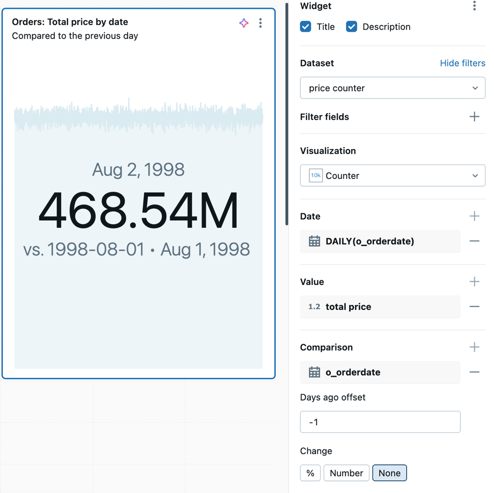
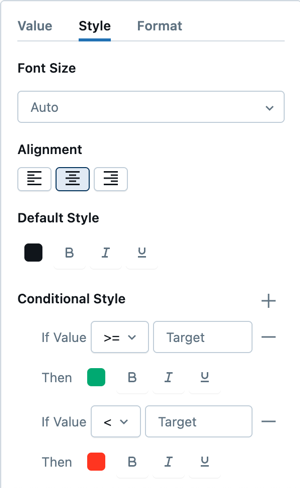
You can set conditional formatting and customize the text style in the Value configuration details.
Format template
To add custom prefix or suffix text around a counter value, enable Format template in the Value configuration details. Use {{ }} syntax to reference values in the template:
{{ @ }}— the raw counter value{{ @formatted }}— the formatted counter value, with any number formatting applied{{ FieldName }}— any other dataset field, such as{{ Region }}or{{ SUM(Profit) }}
Configuration values: For this counter visualization example, the following values were set:
- Dataset:
samples.tpch.orders - Visualization: Counter
- Title:
Orders: Total price by date (compared to the previous day) - Value:
- Date:
DAILY(o_orderdate) - Value:
total price
- Date:
- Comparison:
- Field:
o_orderdate - Days ago offset: -1
- Field:
SQL query: For this counter visualization, the following SQL query was used to generate the dataset:
SELECT
  SUM(o_totalprice) AS `total price`,
  o_orderdate
FROM
  samples.tpch.orders
GROUP BY o_orderdate
ORDER BY o_orderdate DESC;
Custom visualization
This feature is in Public Preview.
Custom visualizations let you build charts with the Vega-Lite library when you need a chart type or customization beyond the built-in options. Select Custom Viz under the Advanced visualization section. For more information, see Custom visualizations in AI/BI dashboards.
Funnel chart
The funnel chart helps analyze the change in a metric at different stages. To use the funnel, specify a step and a value column.
For example, the following funnel chart shows how users progress through stages of a signup flow. Each stage represents a step in the process, with its size reflecting the number of users who reached that step.
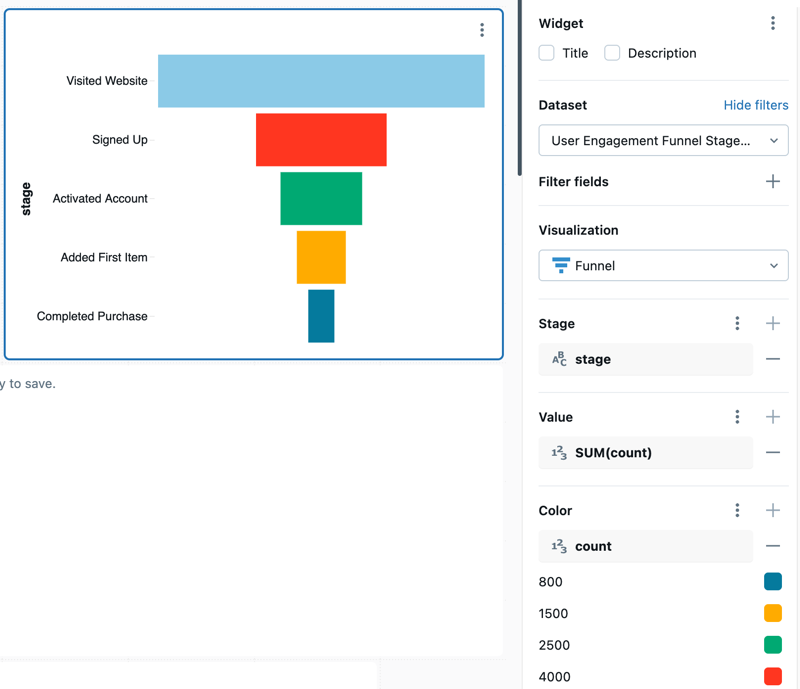
Configuration values: For this funnel chart, the following values were set:
- Dataset: User Engagement Funnel Stages
- Visualization: Funnel
- X axis:
stage - Y axis:
count- Aggregation type:
SUM
- Aggregation type:
- Color column:
- Dataset column:
count
- Dataset column:
SQL query: The following SQL query generated the dataset for this funnel chart visualization.
SELECT *
FROM VALUES
  ('Visited Website', 10000),
  ('Signed Up', 4000),
  ('Activated Account', 2500),
  ('Added First Item', 1500),
  ('Completed Purchase', 800)
AS funnel(stage, count);
Gantt chart
Gantt charts display data as horizontal bars on a continuous axis, encoding the start, end, and duration of each item at a glance. Use them to visualize project schedules, manufacturing workflows, and other events that span a range of time.
Each bar spans from a start value to an end value on the x-axis. The start and end fields must be the same type: date, datetime, or numeric.
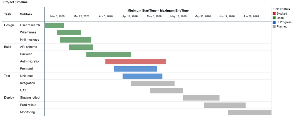
Configuration values: The following Gantt chart example uses these values:
- Dataset: Project Tasks
- Visualization: Gantt
- Rows:
TaskSubtask
- Range:
- Start:
MIN(StartTime) - End:
MAX(EndTime)
- Start:
- Color:
- Field:
FIRST(Status)
- Field:
SQL query: The following SQL query generates the dataset named Project Tasks for this Gantt chart visualization.
SELECT * FROM VALUES
  ('Build', 'API schema', DATE'2026-03-15', DATE'2026-03-29', 'Done'),
  ('Build', 'Auth migration', DATE'2026-04-05', DATE'2026-05-10', 'Blocked'),
  ('Build', 'Backend', DATE'2026-03-25', DATE'2026-04-20', 'Done'),
  ('Build', 'Frontend', DATE'2026-04-10', DATE'2026-05-05', 'In Progress'),
  ('Deploy', 'Monitoring', DATE'2026-06-15', DATE'2026-07-10', 'Planned'),
  ('Deploy', 'Prod rollout', DATE'2026-06-01', DATE'2026-06-25', 'Planned'),
  ('Deploy', 'Staging rollout', DATE'2026-05-20', DATE'2026-06-10', 'Planned'),
  ('Design', 'Hi-fi mockups', DATE'2026-03-10', DATE'2026-03-28', 'Done'),
  ('Design', 'User research', DATE'2026-03-01', DATE'2026-03-12', 'Done'),
  ('Design', 'Wireframes', DATE'2026-03-08', DATE'2026-03-22', 'Done'),
  ('Test', 'Integration', DATE'2026-04-20', DATE'2026-05-15', 'Planned'),
  ('Test', 'UAT', DATE'2026-05-01', DATE'2026-05-20', 'Planned'),
  ('Test', 'Unit tests', DATE'2026-04-15', DATE'2026-05-08', 'In Progress')
AS tasks(Task, Subtask, StartTime, EndTime, Status);
Heatmap chart
Heatmap charts blend features of bar charts, stacked charts, and bubble charts, allowing you to visualize numerical data using colors.
For example, the following heatmap visualizes the count of orders based on their priority and shipping method. The x-axis represents different order priorities, while the y-axis represents various shipping methods. The color intensity indicates the sum of order counts, with a legend showing the order count scale.
Heatmaps can display up to 64K rows or 10MB.
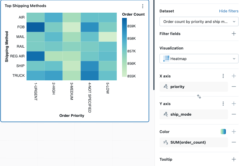
Configuration values: For this heatmap chart visualization, the following values were set:
- Dataset: samples.tpch.orders
- Visualization: Heatmap
- X axis:
priority - Y axis:
ship_mode - Color column:
- Dataset column:
order_count - Aggregation type:
SUM
- Dataset column:
- X-axis name (override default value):
Order Priority - Y-axis name(override default value):
Shipping method - Color ramp:
Green Blue
SQL query: For this heatmap chart visualization, the following SQL query was used to generate the dataset.
SELECT
    o.o_orderpriority AS priority,
    l.l_shipmode AS ship_mode,
    COUNT(*) AS order_count,
    o.o_orderdate
FROM
    samples.tpch.orders AS o
JOIN
    samples.tpch.lineitem AS l
ON
    o.o_orderkey = l.l_orderkey
GROUP BY
    o.o_orderpriority,
    l.l_shipmode,
    o.o_orderdate
ORDER BY
    priority,
    ship_mode;
Histogram chart
A histogram plots the frequency that a given value occurs in a dataset. A histogram helps you to understand whether a dataset has values that are clustered around a small number of ranges or are more spread out. A histogram is displayed as a bar chart in which you control the number of distinct bars (also called bins).

Configuration values: For this histogram chart visualization, the following values were set:
- Dataset: samples.tpch.orders
- Visualization: Histogram
- X column (dataset column):
o_totalprice - Number of bins: 20
- X-axis name (override default value):
Total price
Configuration options: For histogram chart configuration options, see histogram chart configuration options.
SQL query: For this histogram chart visualization, the following SQL query was used to generate the dataset.
SELECT * FROM samples.tpch.orders;
Line visualization
Line visualizations present the change in one or more metrics over time.
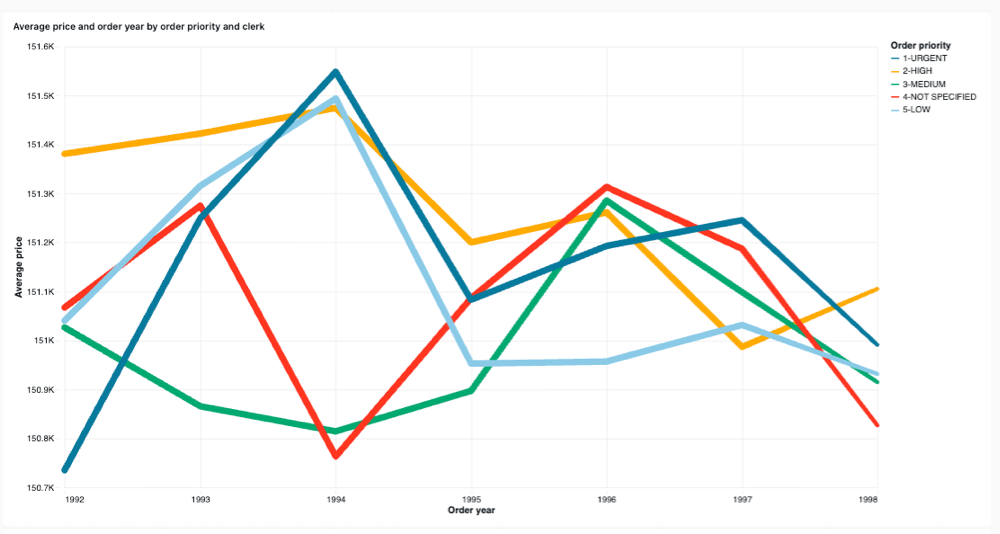
Configuration values: For this line visualization example, the following values were set:
- Dataset: samples.tpch.orders
- Visualization: Line
- Title:
Average price and order year by order priority and clerk - X-axis:
- Field:
o_orderdate - Scale Type:
Continuous - Transform:
Yearly - Display name:
Order year
- Field:
- Y-axis:
- Field:
o_totalprice - Scale Type:
Continuous - Transform:
Average - Display name:
Average price
- Field:
- Color:
- Field:
o_orderpriority - Legend title:
Order priority
- Field:
SQL query: For this line chart visualization, the following SQL query was used to generate the dataset named Orders data.
SELECT * FROM samples.tpch.orders;
Pie visualization
Pie visualizations show proportionality between metrics. They are not meant for conveying time series data.
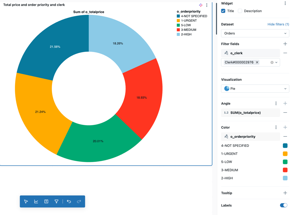
Configuration values: For this pie visualization example, the following values were set:
- Dataset: samples.tpch.orders
- Visualization: Pie visualization
- Title:
Total price by order priority and clerk - Angle:
- Field:
o_totalprice - Transform:
Sum - Display name:
Total price
- Field:
- Color:
- Field:
o_orderpriority - Legend title:
Order priority
- Field:
- Filter
- Field:
TPCH orders.o_clerk
- Field:
SQL query: For this pie visualization, the following SQL query was used to generate the dataset named TPCH orders.
SELECT * FROM samples.tpch.orders;
Pivot visualization
A pivot visualization aggregates records from a query result into a tabular display. It's similar to PIVOT or GROUP BY statements in SQL. You configure the pivot visualization with drag-and-drop fields.
For detailed information about pivot table configuration options, including sticky headers, conditional formatting, and adding links, see Pivot table configuration.
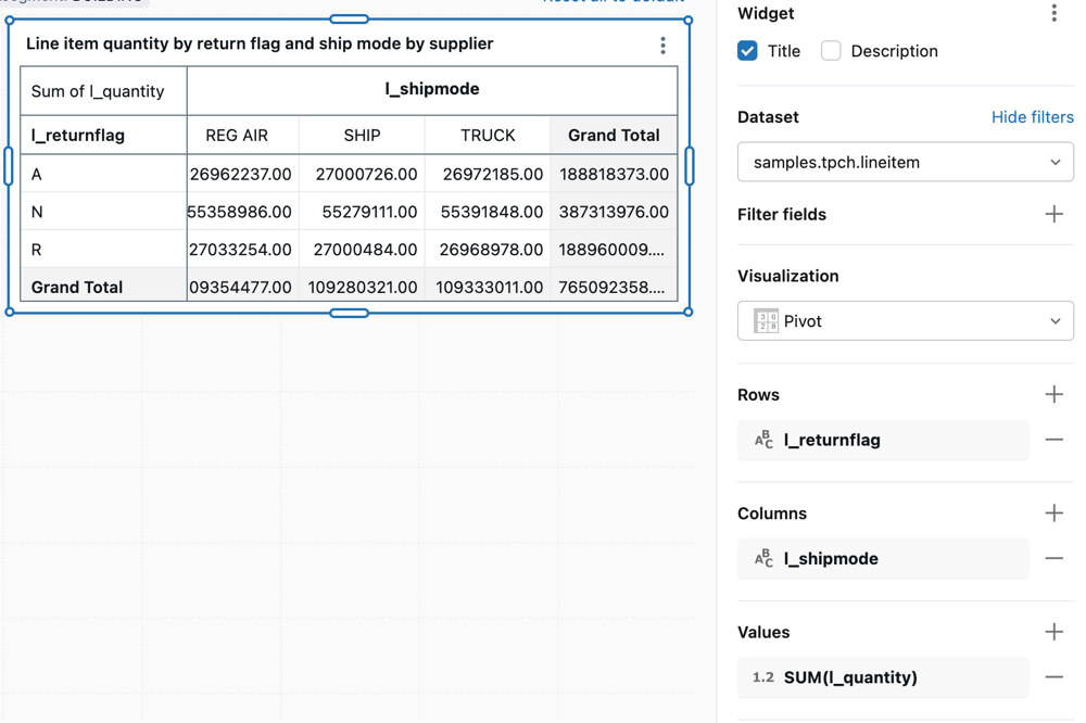
Configuration values: For this pivot visualization example, the following values were set:
- Dataset: samples.tpch.lineitem
- Visualization: Pivot
- Title:
Line item quantity by return flag and ship mode by supplier - Rows:
- Field:
l_returnflag - Display total: Checked
- Field:
- Columns:
- Field:
l_shipmode - Display total: Checked
- Field:
- Values
- Field:
l_quantity - Transform: Sum
- Field:
SQL query: For this pivot visualization, the following SQL query was used to generate the dataset named TPCH lineitem.
SELECT * FROM samples.tpch.lineitem;
Point map
Point maps display quantitative data as symbols placed at specific map locations. Markers are positioned using latitude and longitude coordinates, which must be included as part of the result set for this chart type.
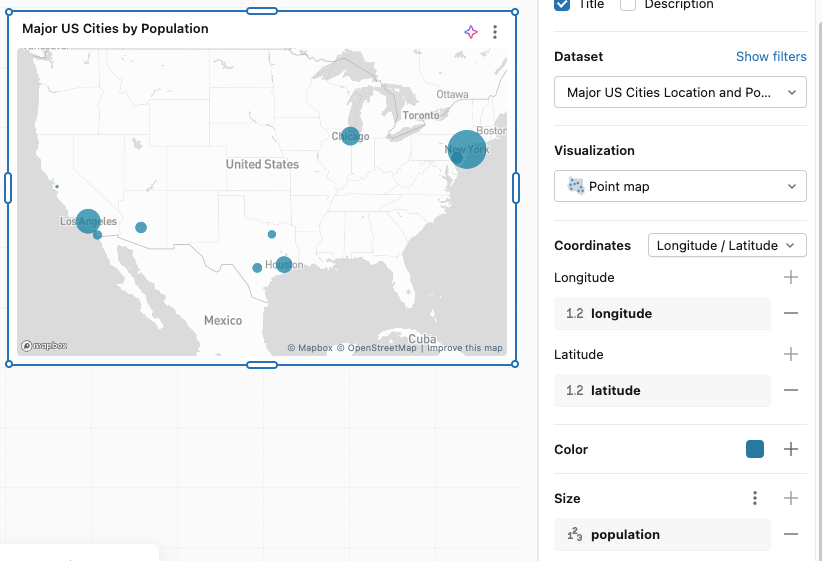
For a configuration example and point map options, see Point map options.
Sankey diagram
A sankey diagram visualizes the flow from one set of values to another.
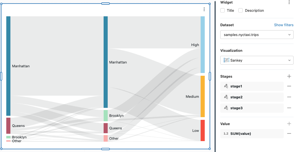
Configuration values: For this sankey diagram, the following values were set:
- Dataset: samples.nyctaxi.trips
- Visualization: Sankey
- Stages
stage1stage2stage3
- Value
- SUM(value)
SQL query: For this Sankey visualization, the following SQL query was used to generate the dataset.
SELECT
  CASE
    WHEN pickup_zip BETWEEN 10000 AND 10299 THEN 'Manhattan'
    WHEN pickup_zip BETWEEN 11200 AND 11299 THEN 'Brooklyn'
    WHEN pickup_zip BETWEEN 11300 AND 11499 THEN 'Queens'
    ELSE 'Other'
  END AS stage1,

  CASE
    WHEN dropoff_zip BETWEEN 10000 AND 10299 THEN 'Manhattan'
    WHEN dropoff_zip BETWEEN 11200 AND 11299 THEN 'Brooklyn'
    WHEN dropoff_zip BETWEEN 11300 AND 11499 THEN 'Queens'
    ELSE 'Other'
  END AS stage2,

  CASE
    WHEN fare_amount < 8 THEN 'Low'
    WHEN fare_amount <= 15 THEN 'Medium'
    ELSE 'High'
  END AS stage3,

  SUM(fare_amount) AS value
FROM samples.nyctaxi.trips
GROUP BY 1, 2, 3
ORDER BY value DESC
LIMIT 50;
Scatter visualization
Scatter visualizations are commonly used to show the relationship between two numerical variables. You can encode the third dimension with color to show how the numerical variables differ across groups.
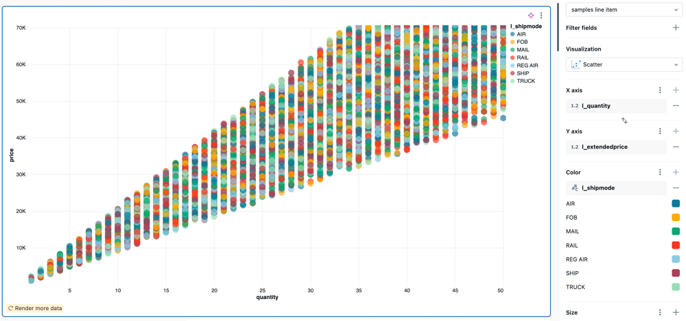
Configuration values: For this scatter visualization example, the following values were set:
- Dataset: samples.tpch.lineitem
- Visualization: Scatter
- Title:
Total price and quantity by ship mode and supplier - X-axis:
- Field:
l_quantity - Display name:
Quantity - Scale type:
Continuous - Transform:
None
- Field:
- Y-axis:
- Field:
l_extendedprice - Scale type:
Continuous - Transform:
None - Display name:
Price
- Field:
- Color:
- Field:
l_shipmode - Legend title:
Ship mode
- Field:
- Filter
- Field:
TPCH lineitem.l_supplierkey
- Field:
SQL query: For this scatter visualization, the following SQL query was used to generate the dataset named TPCH lineitem.
SELECT * FROM samples.tpch.lineitem
Table visualization
The table visualization shows data in a standard table but allows you to manually reorder, hide, and format the data.
Tables can display up to 64K rows or 10MB.
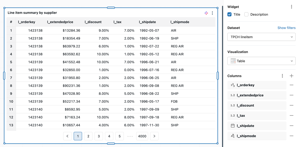
Configuration values: For this table visualization example, the following values were set:
- Dataset: samples.tpch.lineitem
- Visualization: Table
- Title:
Line item summary by supplier - Columns:
- Display row number: Enabled
- Field:
l_orderkey - Field:
l_extendedprice- Format: Custom
- Type:
$(Currency)
- Field:
l_discount- Format: Custom
- Type:
%(Percent)
- Field:
l_tax- Format: Custom
- Type:
%(Percent)
- Field:
l_shipdate - Field:
l_shipmode
- Filter
- Field:
TPCH lineitem.l_supplierkey
- Field:
Configuration options: For table visualization configuration options, see Table and pivot table visualizations.
SQL query: For this table visualization, the following SQL query was used to generate the dataset named TPCH lineitem.
SELECT * FROM samples.tpch.lineitem
Waterfall chart
Waterfall charts display the cumulative effect of sequential positive and negative values, showing how an initial value is affected by a series of intermediate positive and negative values. They are commonly used to visualize financial data, such as profit and loss statements, or to show how different factors contribute to a total change.
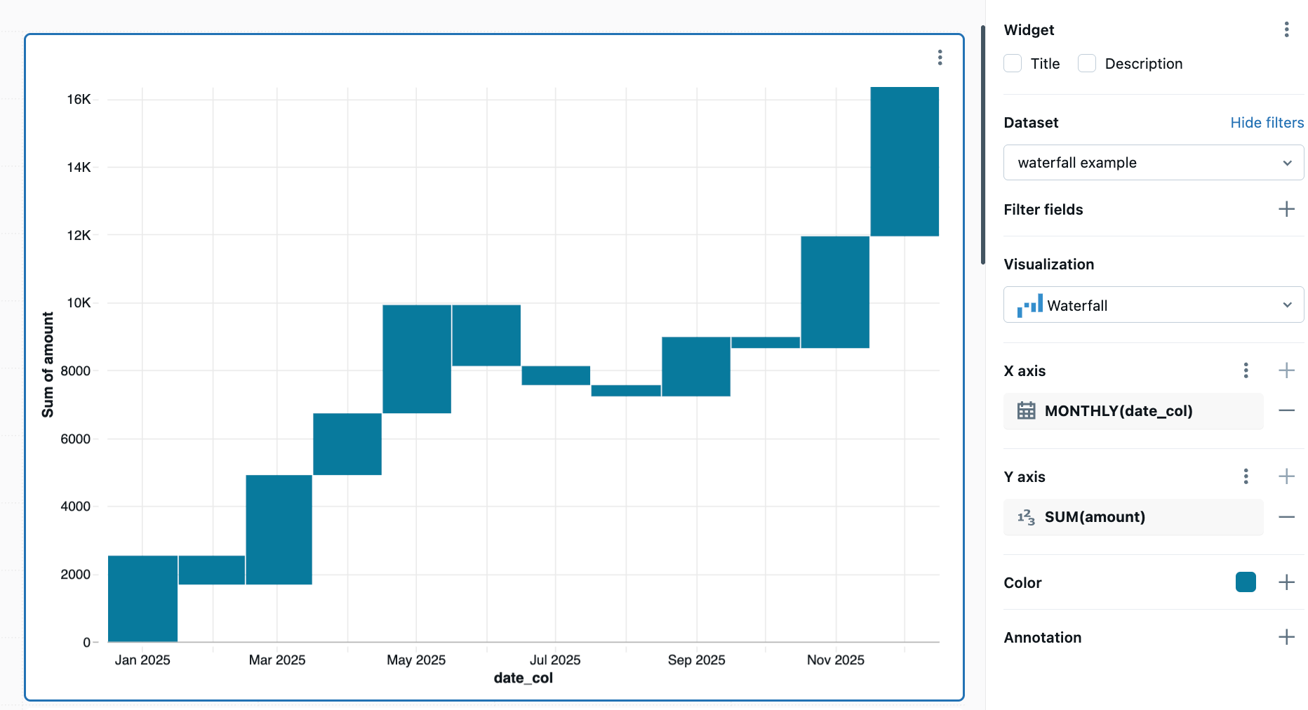
Configuration values: For this waterfall chart example, the following values were set:
- Dataset: Generated by query
- Visualization: Waterfall
- X-axis: MONTHLY(date_col)
- Y-axis: SUM(amount)
SQL query: For this table visualization, the following SQL query was used to generate the dataset.
with base as (
  SELECT
    *
  FROM
    VALUES
      (2535, '2025-01-01'),
      (-853, '2025-02-01'),
      (3229, '2025-03-01'),
      (1820, '2025-04-01'),
      (3195, '2025-05-01'),
      (-1800, '2025-06-01'),
      (-562, '2025-07-01'),
      (-332, '2025-08-01'),
      (1750, '2025-09-01'),
      (-330, '2025-10-01'),
      (3300, '2025-11-01'),
      (4400, '2025-12-01') AS t (amount, date_str)
)
SELECT
  amount,
  cast(date_str as date) as date_col
from
  base